okt 20 2014 12:32 Tom Livingston <[email protected]>:

> I have to agree with Philip here. If you don't know context you can use the
> formula you referenced. That, I believe, is his point. Viewport width is not
> something you will know.
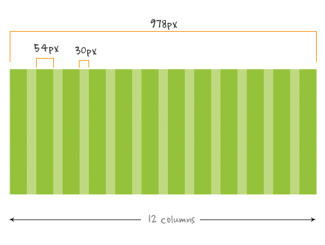
Agree on the obvious, you mean? In the given example, the context was known. It
was 978px total width. If you assume those 978px are 100% of the viewport
width, the size of which is really irrelevant as you don’t know the viewport
size ever without scripting, then percentages for element widths including
gutters are based on those 100% of actual x px width. If it’s 978 px, the
element width will be based on that and if it’s 500px or 1200px it will be base
on those numbers.

That there are ways of setting limits on when you express element widths in
percentages, should not come as a surprise. There exists media queries, which
means you could have a minimum width and a maximum width and shift from gutters
expressed in pixels to gutters expressed in percentages or ems (I prefer the
latter). This is how I usually do it and I assume everybody does something
similar.
>
> If, for example, you know your content will be a max-width of 960px, then you
> can work off of that in the formula.
Which was the case, as there was an example. Why pretend there wasn’t a proper
example that was framing what was being said?
http://www.webdesignerwall.com/wp-content/uploads/2010/09/978-grid.gif

>
> Also, I'd recommend not mixing units as you could be creating a small
> annoying mess. Gutters can be small percentages as well, figured out with
> that same formula.

Generally, that’s good advice, but it really depends on the design requirements.
______________________________________________________________________
css-discuss [[email protected]]
http://www.css-discuss.org/mailman/listinfo/css-d
List wiki/FAQ -- http://css-discuss.incutio.com/
List policies -- http://css-discuss.org/policies.html
Supported by evolt.org -- http://www.evolt.org/help_support_evolt/