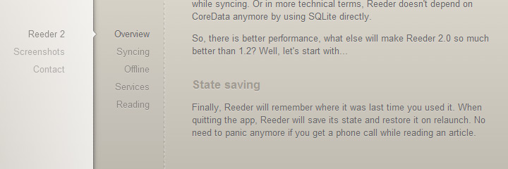
I think that both extremes have negative consequences.

Contrast is a tool for making more/less prominent what it is more/less
important. If you make everything high contrast, or use a very similar grey
palette for all text it becomes hard to communicate what it is more
important and help users to perceive the visual hierarchy. Thus, the
perceived complexity is increased.
they also make controversial choices like pure white text on a pure black
> background

Agree. Another interesting link on why to avoid pure black:
http://ianstormtaylor.com/design-tip-never-use-black/


On Sun, Nov 10, 2013 at 2:38 AM, Quiddity <[email protected]> wrote:

> On 13-11-09 03:08 PM, Steven Walling wrote:
>
>>
>> On Sat, Nov 9, 2013 at 12:57 AM, Pau Giner <[email protected]
>> <mailto:[email protected]>> wrote:
>>
>>     An interesting link defending those ideas with some examples:
>>     http://contrastrebellion.com/
>>
>>
>> I agree we should be very careful to preserve readability, but I find
>> that site a little ridiculous. It's arguing that we don't have to
>> sacrifice aesthetics for readability... and it's ugly as sin. "High
>> contrast" pairings like #cfba58 on black don't help their case.
>>
>>
> Aesthetic choices are subjective. I like their palette, but can see how it
> wouldn't be universally appealing. (which is one of the reasons why we've
> historically gone with a grey or muted palette in Wikipedia. It turns-off
> the least number of people.)
>
> Contrast (in contrast!) is objectively measurable, and #cfba58 on black is
> high-contrast, as checked at http://www.snook.ca/technical/
> colour_contrast/colour.html
>
>
>
>  Readability is not just about contrast. In that very site, they also
>> make controversial choices like pure white text on a pure black
>> background, which is not universally agreed to be easy on the
>> eyes.[1][2] Part of the reason I understand that there's been a movement
>> away from 'pure white on black' as a standard for text is that high
>> levels of contrast can be hard on your eyes with extended reading...
>> such as reading long Wikipedia articles.
>>
>
>
> "extended reading" is not a factor in that site, though... ;P
>
> However, I agree with the general point, and i think the creators of
> contrastrebellion would too, but they concentrated on knocking down the
> target (http://contrastrebellion.com/public/images/page2-img1.jpg), and
> didn't go into the tangential topics of
> very-high-contrast-in-large-quantities,
> or color blindness.
>
> Personally, I've occasionally used the "zap white backgrounds" bookmarklet
> (adapted to use a light grey) found here https://www.squarefree.com/
> bookmarklets/zap.html for many years. Though usually if I start to get
> eyestrain from reading too much Wikipedia, that's a sign that I'm overdue
> for a stand&stretch, or I need to adjust my room's lighting. :)
>
>
>
>> 1.
>> http://uxmovement.com/content/when-to-use-white-text-on-a-
>> dark-background/
>> 2. en.wikipedia.org/wiki/Light-on-dark_color_scheme
>> <http://en.wikipedia.org/wiki/Light-on-dark_color_scheme>
>>
>>
>>
>> --
>> Steven Walling,
>> Product Manager
>> https://wikimediafoundation.org/
>>
>>
>> _______________________________________________
>> Design mailing list
>> [email protected]
>> https://lists.wikimedia.org/mailman/listinfo/design
>>
>>
>
> _______________________________________________
> Design mailing list
> [email protected]
> https://lists.wikimedia.org/mailman/listinfo/design
>


--
Pau Giner
Interaction Designer
Wikimedia Foundation
_______________________________________________
Design mailing list
[email protected]
https://lists.wikimedia.org/mailman/listinfo/design