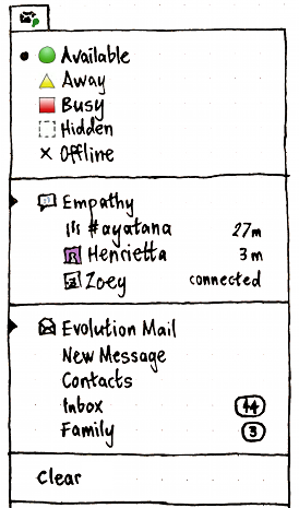
On Thu, Oct 6, 2011 at 11:30 AM, Siegfried-Angel Gevatter Pujals
<[email protected]> wrote:
> 2011/10/6 Martyn Russell <[email protected]>:
>> Or, similarly to how mac did it? does it? using a jumping icon or changing
>> the colour or some notification which is subtle. With an icon appearing in
>> the top (like the battery icon) which allows you to use your contacts
>> (favourite or recently communicated with and have access to the contacts
>> app/dialog), that would be a nice way to avoid needing the roster entirely
>> generally. You could see notifications grouped there.
> You mean something like this?
>
> https://wiki.ubuntu.com/MessagingMenu?action=AttachFile&do=get&target=messaging-menu.png
Please, no catch-all menus in GNOME 3. This is "systray" all over
again except that it's vertical now.

--
Patryk Zawadzki
I solve problems.
_______________________________________________
desktop-devel-list mailing list
[email protected]
http://mail.gnome.org/mailman/listinfo/desktop-devel-list