Hi developers.

Tuesday evening, after trying to fix all issues that integrate Workspace in
XE made, I had a bit of time to work on this JIRA:
http://jira.xwiki.org/browse/XWIKI-9341 "Menu improvements when Workspaces
activated".
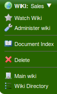
The idea was to quickly implement the Caty's proposal for M2 (which was
scheduled for the day after). I made it and I sent a pull request. I have
also sent a mail to Vincent to show him my work.

== Proposal A ==
There is some screenshots (Proposal A):
Logged as admin:
http://xwiki.kephpage.net/proposals/workspaces-menus/new-home-menu.png
Not logged as admin:
http://xwiki.kephpage.net/proposals/workspaces-menus/new-home-menu-non-admin.png

You can get it from this commit:
https://github.com/xwiki/xwiki-platform/commit/8c1c1bac2cde30f9024525e50249382e3d2c4138
(except that I have changed the wiki icon for this screenshot)

We though this menu was confusing and not consistent with the current menus:
- Why do we have a link to the *main wiki* administration when we are in a
(sub)wiki? Does it make sense?
- Why do we have the main wiki (called Home) in the left of the current
wiki, space and page? The fact that there is actually a "main" and several
"sub" wikis is only due to the implementation. We could imagine, in the
future, a new implementation where there is no distinction between "main"
and "sub", but where we have an independent "system" that allows the users
to create and manage their wikis. Then, it seems better to call the menu
"System" or "XWiki".
- When we don't have the admin right on the main wiki, we only have a
single item in this menu, meanwhile wiki, space and page has more content.
It does not look good.
- If you are in the main wiki, you have "Administer main wiki" twice: once
in the Home menu, once in the Wiki menu.
- The left menu has too many items.

== Proposal B ==
Vincent thought it was not good enough to be integrated in 5.2M2, so we
started to iterate until having this proposal:
http://xwiki.kephpage.net/proposals/workspaces-menus/new-xwiki-menu.png(proposal
B).

Why putting this menu to the right side? It's because, on the left side, we
have Wiki/Space/Page, where you have actions that you can actually achieve
on these Wiki, Space and Page. Actions like "Administer", "Delete" or
"Rename". The XWiki menu does not provide actions like that, it just
provides some shortcuts to navigate thought the wikis. It's more a "System"
menu, like the Profile menu, or the Register action. That's why we put it
there. Moreover, it make the left menu smaller, which is less confusing.

== Proposal C ==
We had also this idea:
http://xwiki.kephpage.net/proposals/workspaces-menus/wiki-menu.png(proposal C)
But we didn't like it, because the "Wiki Directory" and the "Main Wiki"
link are not related to the current wiki, meanwhile actions like
"Administer", "Index" or "Delete" are.

---
After having created the proposal B, I asked Vincent: "What should I do? Do
I commit it, without asking to the community?". He said yes, because he
wanted to have something to show to the community that can still be changed
for the RC1, and he applied the pull request.

So, let me list again the 3 proposals we have:

A - "Home" menu (Caty's proposal):
Current implementation:
http://xwiki.kephpage.net/proposals/workspaces-menus/new-home-menu.png
Mockup with the new skin:
http://incubator.myxwiki.org/xwiki/bin/download/Improvements/PortalMenu/MenuPortal.png

B - "XWiki" right menu:
http://xwiki.kephpage.net/proposals/workspaces-menus/new-xwiki-menu.png

C - Add actions to the "Wiki" menu:
http://xwiki.kephpage.net/proposals/workspaces-menus/wiki-menu.png

I propose to start a thread where you can all give your opinion, regarding
one of these proposals, and you can also bring new ideas. We must have a
consensus for the RC1!

 0 for proposal A (the left menu is too heavy).
+0 for proposal B (not perfect IMHO).
-1 for proposal C.

Louis-Marie
_______________________________________________
devs mailing list
[email protected]
http://lists.xwiki.org/mailman/listinfo/devs