Now this is motivated strictly by my own experience, but I can't imagine
it being an uncommon one, so here goes.
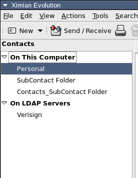
It seems we need some better visual cue for which component is active.
We have the toggle buttons, but this isn't where the eye is drawn when
looking at the sidebar, particularly if you have few folders and a tall
window.  Since all components have an "On This Computer" group at the
top, it's even more confusing.

Sooo, I propose we put back something like the gray title bar, only not
showing the currently selected folder - just showing the currently
active component.  And limit it to just the sidebar area.

Here's an example:

http://www.hungry.com/~toshok/images/upper-visual-cue.png

We should have the component's icon up there as well, and of course it
should be layed out a bit better, and probably be slightly larger text
to differentiate it from the text in the source selector, etc.

thoughts?

Chris
_______________________________________________
evolution-hackers maillist  -  [EMAIL PROTECTED]
http://lists.ximian.com/mailman/listinfo/evolution-hackers