One tip for better font rendering in XP is as follows.
 Right-click the desktop, and select Properties.  (Or
go to Control Panel / Display.)  On the Appearance
tab, click the Effects button.  In the Effects window,
select, "Use the following method to smooth edges of
screen fonts" (checkmark in selection box), and in the
options dropdown, select ClearType.  Click OK, Apply,
etc.  I've not tried this with the problem described
below, but this setting does make a very noticeable
improvement everywhere else.
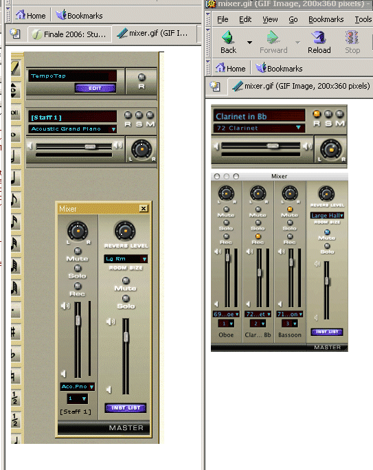
There is a similar ClearType option in Windows 2000,
and maybe even Windows ME.  In XP, it's a big
improvement.

Regards,
-kk
----------------------------------------------------------------------

> Date: Wed, 27 Jul 2005 22:43:17 -0400
> From: Aaron Sherber <[EMAIL PROTECTED]>
> Subject: Re: [Finale] Fin2006 first impressions
> To: [email protected]
> Message-ID:
> <[EMAIL PROTECTED]>
> Content-Type: text/plain; charset="us-ascii";
> format=flowed
>
> At 10:30 PM 07/27/2005, David W. Fenton wrote:
>  >Not on my PC:
>  >
>  >http://dfenton.com/Mixer.gif
>
> Okay, well now we're just splitting hairs. I'll
> grant you that the
> characters in my screenshot have sharper outlines,
> but the characters
> are all chunky, like an old-fashioned bitmap font.
> The characters in
> the Finale screenshot are more recognizable as
> characters, even
> though they're fuzzy.
>
> And the fuzziness is largely due to the fact that
> the Finale
> screenshots are probably slightly reduced. In the
> Fin2006 Quick Start
> Guide, there's a pasted screenshot -- also from the
> Mac version -- in
> which the font is quite clear.
>
> And Winsupport has already admitted that the font
> reads much less
> well in Windows than it does on Mac. They said, "I
> think it has to do
> with the new display controls in the Mac OS," which
> sounds like a
> rather lame excuse.
>
> Aaron.
>
>
>


http://www.kevinkastning.com
_______________________________________________
Finale mailing list
[email protected]
http://lists.shsu.edu/mailman/listinfo/finale