Product: Fedora
https://bugzilla.redhat.com/show_bug.cgi?id=856239
--- Comment #94 from Ilya <[email protected]> ---
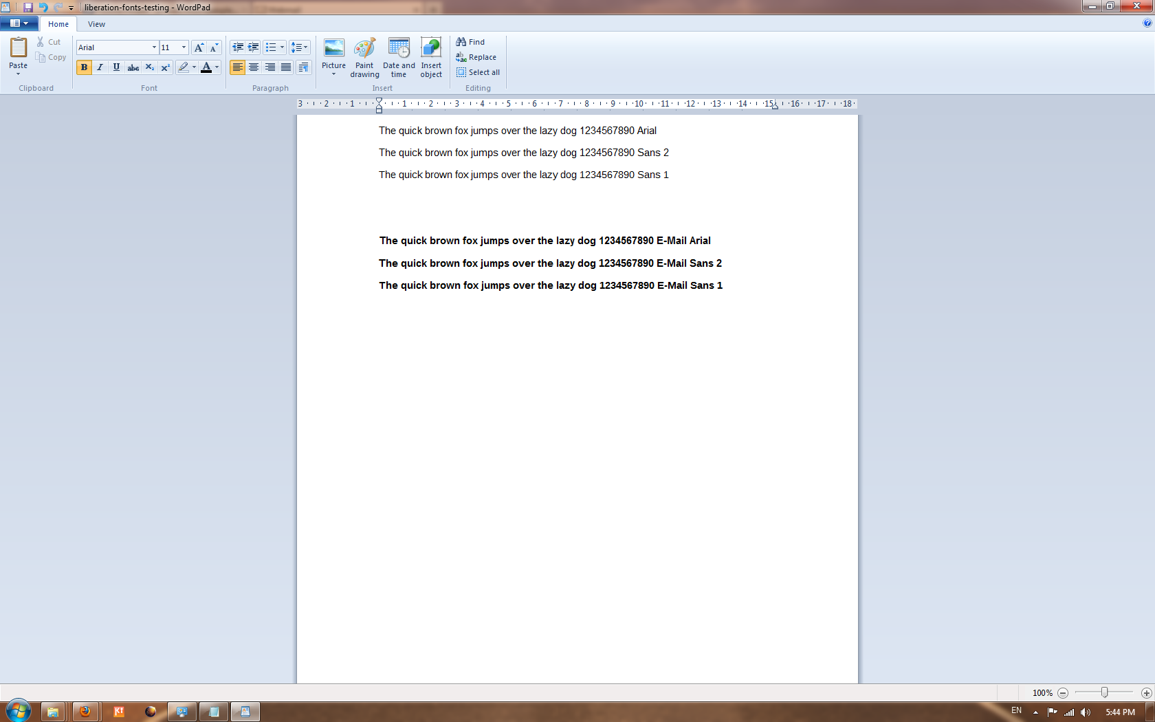
> http://pravins.fedorapeople.org/liberation/comparison-of-arial-liberation-1-and-2.png

I do not think it is good: for example, the first vertical line in "m" is
thicker than the others. There is multiple "rainbow" effect. Vertical lines in
"1" and in "f" are thick and reddish (f is reddish for Sans 1 and blueish for
Sans 2). Arial is displayed much better.

--
You are receiving this mail because:
You are on the CC list for the bug.
_______________________________________________
fonts-bugs mailing list
[email protected]
https://admin.fedoraproject.org/mailman/listinfo/fonts-bugs
http://fonts.fedoraproject.org/