Product: Fedora
https://bugzilla.redhat.com/show_bug.cgi?id=856239
--- Comment #96 from Pravin Satpute <[email protected]> ---
Thanks Tagoh and Ilya for observation on windows rendering. But if you notice
two more things
In Fedora 18 Liberation 2 looks more thick and fuzzy compare.
While in Windows it looks almost close to Arial and Sans1

I did some more testing with
http://pravins.fedorapeople.org/liberation/liberation-fonts-testing.rtf on
Windows and Fedora 18

1a.
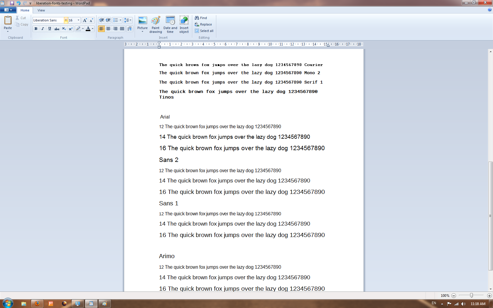
http://pravins.fedorapeople.org/liberation/arial-sans2-sans1-arimo-testing2-windows7.png
  - On Windows all Arial, Sans 1 & 2 and Arimo hinted sharply.

Vs

1b.
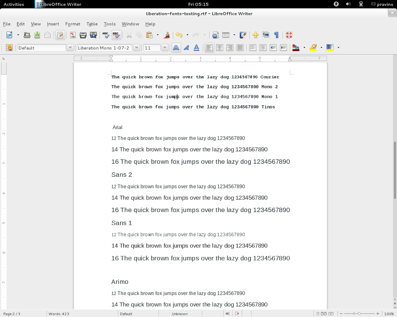
http://pravins.fedorapeople.org/liberation/arial-sans2-sans1-arimo-testing2-fedora18.png
- On Fedora see how output varies from Windows7, Only Sans1 produce sharpaly
hinting.


2a.
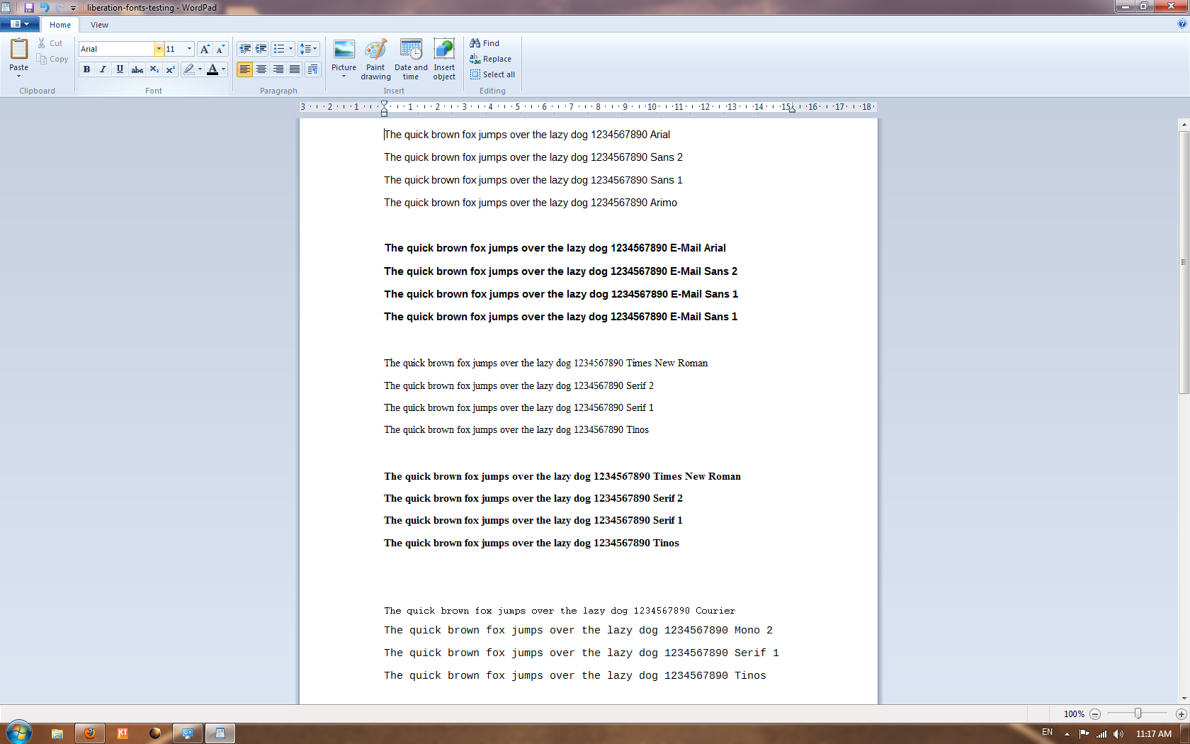
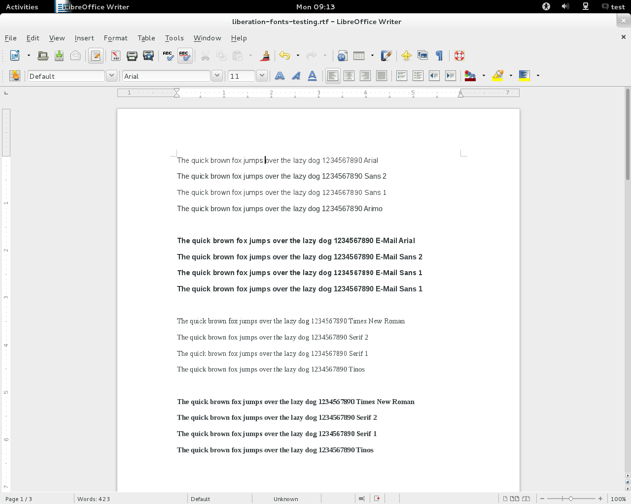
http://pravins.fedorapeople.org/liberation/arial-sans2-sans1-arimo-testing-fedora18.png
 -  As we increase size, output is almost same.

2b.
http://pravins.fedorapeople.org/liberation/arial-sans2-sans1-arimo-testing-windows7.png
- Again here sharp hinting on Windows.


So from these observation, i think font is not at the fault. whether Croscore
or Liberation2, its underlying hinting mechanism which affect outputs.

Liberation 1 looks good on Both platform. But same is not with Sans2 and
Croscore.

--
You are receiving this mail because:
You are on the CC list for the bug.
_______________________________________________
fonts-bugs mailing list
[email protected]
https://admin.fedoraproject.org/mailman/listinfo/fonts-bugs
http://fonts.fedoraproject.org/