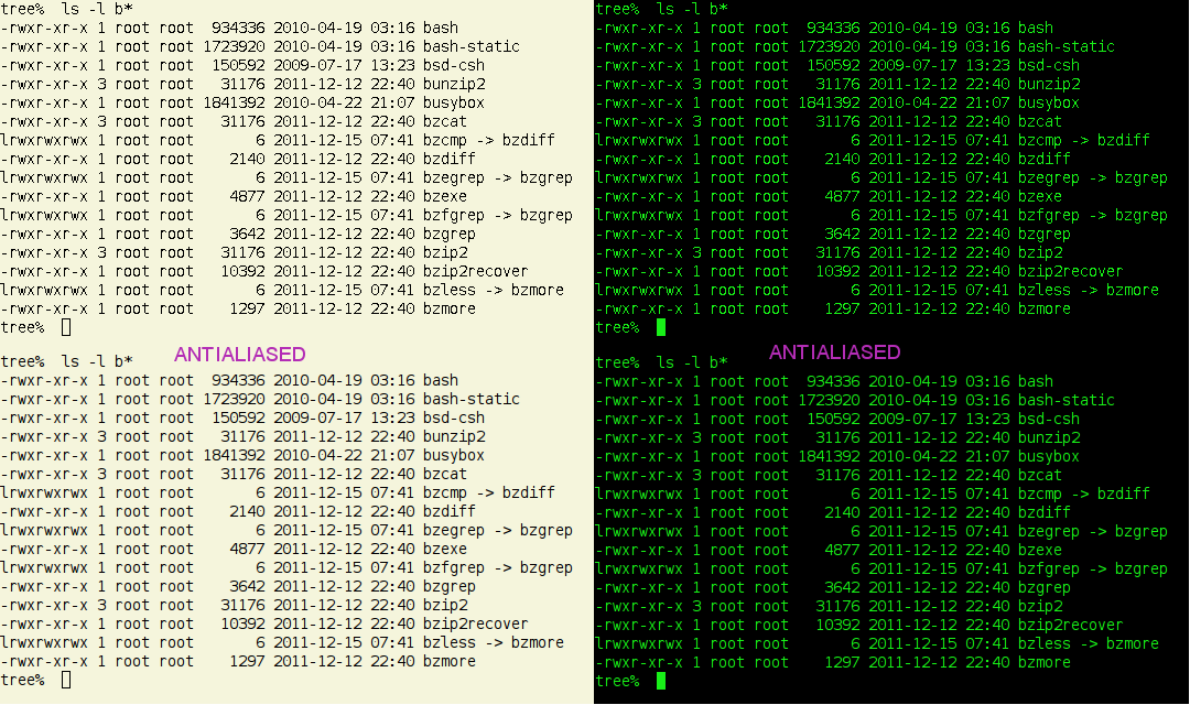
I have been for a long time rather unhappy with anti-aliasing
because of it makes text bolder and fuzzier than it should be,
at least on monitors with 100DPI or so, but I have recently
realized, as described here:
  http://www.sabi.co.uk/blog/12-two.html#120206

and in particular by this side-by-side comparison image:

  http://www.sabi.co.uk/Misc/snapFontAliasingDarkLight.png

that anti-aliased text looks very different on dark backgrounds
(thinner, not so fuzzy) than on light ones (thicker, fuzzier).
This is all without subpixel anti-aliasing (gray-level only).

My guess is that this happens because at around 100DPI most 10
point fonts render with 1-pixel wide features, and ''graying''
around that makes it look thicker, but how dark the gray is
matters a lot: if it is lighter, on light backgrounds the
apparent extra thickness will be less apparent, and viceversa on
dark backgrounds.

Therefore it would be nice to be able to control how dark is the
anti-aliased "fuzz", so it can be rather lighter than the default
on light backgrounds and a little darker on dark backgrounds.

Is there a runtime tweakable already?

_______________________________________________
Freetype mailing list
[email protected]
https://lists.nongnu.org/mailman/listinfo/freetype