 Hi Claude,

Thanks for your suggestion. However, my harddrive died and I am unable to
change the logo until I find my old photoshop CD, which might take some time
XD.
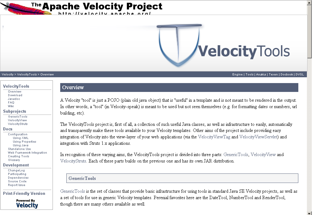
I'm going to email the dev for voting on which logo looks the best. If more
people like the design that you like, I'll recreate it.

Regards,

Edward

On 12/15/07, Claude Brisson <[EMAIL PROTECTED]> wrote:
>
> Some more -subjetive- feeback :
>
> I really prefer the T of the first version - much softer and lighter.
> And colors were good. Sthing very heavy in the second proposal, whereas
> the first one recalls me of sthing inbetween of a conceptual
> contemporary art artefact and a glass of wine... necessarily
> sympatico... subjective, I told you... what about working around the
> first proposal in the way I suggest here (only poorly crafted by means
> of ugly cuts and pastes from you image):
>
> http://people.apache.org/~cbrisson/ApacheVelocityTools.png
>
>
>    Claude
>
> Le mercredi 12 décembre 2007 à 17:54 -0800, Edward a écrit :
> > Hi,
> >
> > Thanks for giving me feedback. Heres an updated version:
> > [image: ApacheVelocityTools2.png picture by shadowpwner]
> > and a link for those who can't see it:
> >
> http://i226.photobucket.com/albums/dd53/shadowpwner/ApacheVelocityTools2.png
> >
> > I tried to make the T look more like a T, but now to me it looks like a
> > tongue :P (See the resemblance?)
> >
> > Also, here it is with the current template:
> >
> >
> http://i226.photobucket.com/albums/dd53/shadowpwner/VeltoolsNewLogoPS2.png
> >
> > The logo will probably be 50% of the current size, I enlarged it so you
> > could see the details.
> >
> > Regards,
> >
> > Edward
> > On Dec 11, 2007 8:57 PM, Nathan Bubna <[EMAIL PROTECTED]> wrote:
> >
> > > Hey Edward,
> > >
> > > That's a pretty good start, though i confess that it took me a second
> > > to realize that the symbol was a V with a T inset.  The T is
> > > particularly hard to recognize.  Still, the symbol looks a lot
> > > snazzier than the current meager wrench (no offense, if you're still
> > > out there Tim Colson :).   I do think the color scheme could use some
> > > adjustment to fit better, as it clashes a bit right now.  I attached a
> > > screenshot of this draft logo in the velocitytools docs to show that.
> > >
> > > I think that's it for stylistic feedback.  I'm not really the best at
> > > that.  Functionally, the logo will need to be smaller and could
> > > probably stand to have some of the surrounding whitespace reduced to
> > > make better use of its space.
> > >
> > > Thanks for working on this!  I'm excited to have a nice logo for once!
> :)
> > >
> > > peace,
> > > nathan
> > >
> > > On Dec 11, 2007 7:17 PM, Edward <[EMAIL PROTECTED]> wrote:
> > > > Hello All,
> > > >
> > > > I entered the Google Highly Open Participation Contest for the
> Velocity
> > > > Tools logo.
> > > >
> > > > Here is my proposition so far:
> > > >
> > > > [image: ApacheVelocityTools.png picture by shadowpwner]
> > > >
> > > > In case the image doesn't show:
> > > >
> > > >
> > >
> http://i226.photobucket.com/albums/dd53/shadowpwner/ApacheVelocityTools.png
> > > >
> > > > Please note this will not be the final draft, but only something to
> > > start us
> > > > off with.
> > > >
> > > > Please give helpful comments and suggestions, to improve my work.
> > > (Example:
> > > > Too simple, colors don't match layout, etc.)
> > > >
> > > >
> > > > Regards,
> > > >
> > > > Edward
> > > >
> > > >
> > >
> http://code.google.com/p/google-highly-open-participation-asf/issues/detail?id=52
> > > >
> > >
> > > ---------------------------------------------------------------------
> > > To unsubscribe, e-mail: [EMAIL PROTECTED]
> > > For additional commands, e-mail: [EMAIL PROTECTED]
> > >
> > >
> >
> >
>
>


--
Light travels faster than sound. This is why some people appear bright until
you hear them speak.