On May 7, 2009, at 3:48 PM, Catherine Burton wrote:
Nothing says well-conveyed information like a good map:
http://tipstrategies.com/archive/geography-of-jobs/
Ruh-roh:
        http://mike.teczno.com/img/jobs-gained-jobs-lost.png
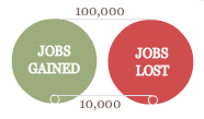
you're pointing out it seems to be radius rather than area based?
Yeah, it really blows the 100k jobs circles way out of proportion. The
time browsing is well done, but I think that using the radius as a
measure was probably a mistake. The view at the very end of the map,
March 2009, is a serious exaggeration.
On the plus side, Hurricane Katrina in 2005 and Detroit in 2006
particularly stand out. It would be nice if it were possible to scrub
time back & forth.
-mike.

----------------------------------------------------------------
michal migurski- [email protected]
                 415.558.1610


_______________________________________________
Geowanking mailing list
[email protected]
http://geowanking.org/mailman/listinfo/geowanking_geowanking.org