Interesting. Then I'll restate things and try to answer correctly to your
comments. Sorry, that will be a long post again :/ but I really need that
to show that the CLT partly fails in this case.
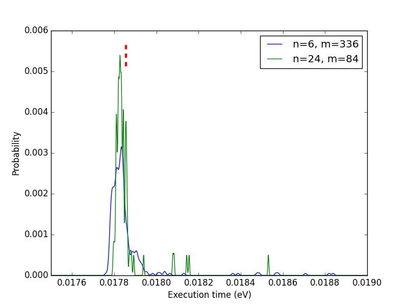
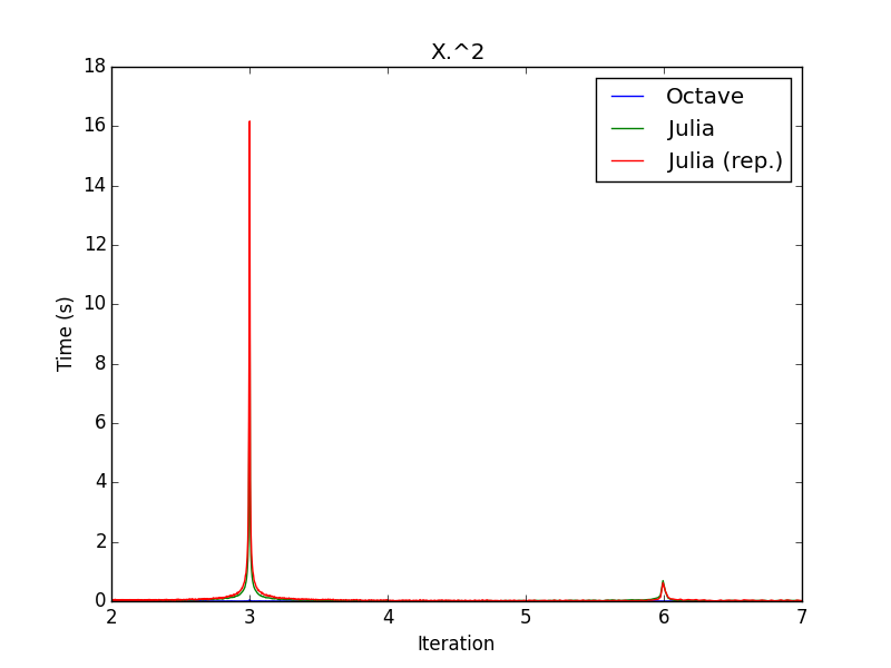
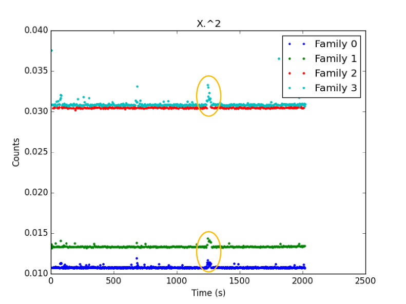
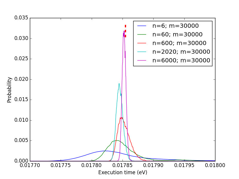
*1- Restating things: the function run a single time *

I know this is not what you are interested in. But I hope I'll be clearer
there.

Some functions can be used rarely but can take a substantial time in the
whole calculation. From what I see, people just repeat the calculation *n*
times, take the arithmetic mean and choose whichever gives the smallest
number.

*Question:* which function of *f1* and *f2* is the fastest for a single
calculation given that set of inputs on *that* computer?

*Method 1:* put @time in front of each of them and get timing results.
*Problem 1:* this is not the answer to the question above:

   - Instead of trying to answer to: *which function would always be faster
   on my computer with that set of input?*
   - he answered: *which function was faster that time?*

*Problem 2: *Chances are high that "always" is too strong. "Generally"
could be used instead.


*Method 2:*

> if you perform an operation n times, it will take about nμ seconds. If you
> want your code to run as fast as possible that's probably what matters.
>
So, if I repeat the measurement *n* times and divide the resulting
execution time by *n*, I should get a good estimate of the expected
execution time.

*Problem:* "g*enerally*" is a word so vague that it is not enough! What
does it mean? Pick your poison:

   - Is *f1* faster than* f2* in more than *X*% of the cases? (hint: the
   arithmetic mean tells us *nothing* about that)
   - What is the most probable execution time? (hint: this is usually *not*
   the arithmetic mean, eg. the geometric mean for the lognormal ditribution)
   - What's the range including *X*% of the execution times for* f1*/*f2*?
   (hint: its center is usually *not* the arithmetic mean)
   - etc.

So not everyone wants the same thing. Plus, if you calculate the arithmetic
mean of some repetitions, you take into account effects that may slow down
(GC, OS over time, etc.) or speed up (cache, buffers, etc.)  the
calculation and give a perfectly wrong estimate. The second thing is that
the arithmetic mean is almost always not what you want and is always not
enough (at least provide the variance if you are sure the distribution is
Gaussian). And as John emphasized, the mean or any other location estimator
tells us nothing about the distribution spread.

*Method 3:* plot histograms/PDF and let other people pick their own poison.
*Problem: *not a single number, but a complete distribution.
*Advantages:* everything is included and distribution metrics can be
calculated from that; the spread is known; normality can actually be
checked, if you observe so, you can tell is some function is *always*
slower than another one, etc.


*2- How the CLT may sometimes partly failed *

Ok, let's state it now: the CLT is working quite well, it's just that some
of our assumptions about it aren't. :)

In the world of technical computing, we are mostly interested in running
> the same computationally intensive functions over and over, and we usually
> only care about how long that will take.
>
comes down to:
*Question:* which function of *f1* and *f2* is the best suited to put
inside of a tight loop?

You appropriately and correctly invoked the CLT:

> the central limit theorem guarantees that, given a function that takes a
> mean time μ to run, the amount of time it takes to run that function n
> times is approximately normally distributed with mean nμ for sufficiently
> large n regardless of the distribution of the individual function
> evaluation times as long as it has finite variance.
>

But let's split that a little bit and check it :)

*2.1- The central limit theorem*

The CLT is all about sums. If you draw *n* samples from the distribution* D*
and perform a sum of them, you will get one number *N1*. If you draw *n* new
samples
from the same distribution* D* and perform a sum of them, you will get a
new number *N2. *etc. Let's say you performed that operation *m* times.
Then you got *m* sums of *n* elements from distribution *D*: *N1...Nm*.

The central limit theorem states that the distribution of the numbers *N1...Nm
*should converge to a normal distribution as *n* goes to infinity. It can
be justified by convolution: the distribution of the *N1...Nm* corresponds
to the self-convolution of the initial distribution *D*, *n* times. And it
so happen (and was proven) that any distribution with finite variance
should converge to a Gaussian as *n* tends to infinity.

Even more interesting, if you divide these sums *N1...Nm* by *n*, you get a
mean which variance is *always* smaller than the variance  of the initial
distribution D.

These two behaviors are the roots of the CLT.

*2.2- Wash it, repeat, rinse, n times*

You are proposing to calculate *N1* only, *not* *N1...Nm*, *not* the
elements of *N1*. The rational behind it being that if *n* is large enough,
the variance of the resulting self-convoluted distribution should be so
small that it could be considered a negligible quantity.

That is very sensible. The thing is that, once again, you have no data to
back that up with a single @time. A raw arithmetic mean really won't help
you. This is usually fine for very small functions. But when you want to
benchmark bigger ones, you will do less repetitions, and your approximation
won't hold that well.

*2.3- Total mean vs. complete CLT*

We can simulate a CLT calculation by considering that our 2020 points are
actually a series of measurements of *m* groups of *n* repetitions:

<https://lh6.googleusercontent.com/-BJM_JDHrOF0/VBWCoYgvp1I/AAAAAAAAAEY/KU1RdU6NrRI/s1600/CLT0.png>
Here as you can see, the CLT is true: from our complicated initial
distribution, we got something which is more or less Gaussian and as *n*
increases and variance seems to drop. Good.

But, what are those red dashes above? Those represent the location of the
arithmetic mean of the 2020 measurements. As you can see in this case, the
global mean overestimates the most probable range of our distributions? To
explain a bit further, the blue curve represents the distribution of the
mean over 6 consecutive elements from the 2020-valued complete measurement.
So one could integrate this curve to obtain the cumulative density function
(CDF). If we look where the arithmetic mean is on these CDF, we can show
that in the n=6 case, the mean corresponds to 80% of probability (80% of
measured times are below it) and this number raises to 90% for n=24. That
shows that the arithmetic mean is not a good location estimator.

But how is that possible?
*I'll answer in the following parts.*

BTW, is m=84 enough in the n=24 case?
*May I remind you that you say m=1 is enough? But I'll also elaborate on
that.*

*2.4- Rebuilt CLT from initial distribution*

To explain that discrepancy, we can rebuild the CLT from the initial
distribution to see it more clearly:

<https://lh4.googleusercontent.com/--_lPgdqUzUw/VBWCug4suEI/AAAAAAAAAEg/VRt1EdT99u0/s1600/CLT1.png>

Good news: we have something more centered on the arithmetic mean; the CLT
is respected. Bad news: the distributions are completely and utterly wrong!

*2.5- What went wrong?*

Remember?

<https://lh6.googleusercontent.com/-R1m0ZbqDIKo/VBWC0aDzvQI/AAAAAAAAAEo/jHQBDjpbHBA/s1600/CLT2.png>

What it means is that we have periodic stuff. Order matters !!! So we
cannot just construct the CLP distribution from the initial one and
ignoring the order. We have to be smarter.

*2.4- Being smarter*

Here was the time vs. iteration plot:

<https://lh5.googleusercontent.com/-UlCyUjoPC1Y/VBWC31U4n9I/AAAAAAAAAEw/a0oFNNLbR1Y/s1600/CLT3.png>
These points are divided into 4 groups clearly visible there. We already
showed that "Family 0" occurs twice as much as the 3 other families
together. The yellow circles emphasize a small bump (likely due to OS
stuff). It's worth noting that my clustering algorithm was very dumb :
while family 0 could be perfectly separated from family 1, some values that
should be in family 2 were accounted for in family 3.

We can plot the PDFs corresponding to these curves:

<https://lh3.googleusercontent.com/-Hvp9tr2mlPg/VBWC7IIFj8I/AAAAAAAAAE4/yzcgafv_new/s1600/CLT4.png>
So, here, instead of considering the whole distribution and
self-convoluting it, we could divide it in 4 families to take ordering into
account. Now let's look at the distribution of those level. For instance,
by taking n=6, which means that we are looking at all the consecutive
groups of 6 points in our data and counting which point belongs to which
family:

<https://lh5.googleusercontent.com/-_O62fSbNSR4/VBWDAb7GaSI/AAAAAAAAAFA/0JlxzX8X954/s1600/CLT5.png>
As you can see, by taking groups of n=6 iterations, the baseline (family 0)
converges to an occurrence of 3/6 and the 3 others are roughly 1/3 (most of
the family 2 -> 3 bumps are only my failure to provide a better clustering
algorithm).

We are very very lucky: since the occurrences of the 4 families are
constant through the data, we don't have to perform multivariate kernel
density estimation (yeah!). Let's take that into account and calculate new
distribution:

<https://lh3.googleusercontent.com/-D1V2ZSG3Iwk/VBWDC4SmEVI/AAAAAAAAAFI/XJgC7j4D238/s1600/CLT6.png>
Ah! That's *much* better (for the details, I used a Monte-Carlo algorithm,
hence the values of *m*, the number of MC samples which corresponds to the
number of averaged values: *N1...Nm*).

Wonderful, now the mechanism is grasped. This is yet another advantage of
gathering individual values: you can try to reconstruct the final
distribution. If it is not working (as in the attempt of part 2.4), then
something more fishy is going on.


*2.5- What about just calculating N1 for very high n numbers?*

This is what you proposed. This is also what triggered that second very
long post. So let's see now if it is a good approximation:

<https://lh6.googleusercontent.com/-AXk1GbS9v-s/VBWMMJiMw3I/AAAAAAAAAFY/pdIVCXhbDJs/s1600/CLT7.png>
First checks: the CLT is working *very well*. As *n* increases:

   - The distribution gets more and more Gaussian (the right-end tail tends
   to disappear);
   - The variance is very clearly decreasing.

Now what do those curves mean? At least three things:

   1. If you just calculate *N1*, you are doing with your loops what you
   may reproach to people who are comparing execution time using @time on one
   run. The only difference is that if *n* gets larger, the variance gets
   smaller. But, once again, if you don't measure single values, you can't
   calculate the variance, so you have absolutely no idea of your error. The
   curves above are a really good example: the arithmetic mean of my
   2020-valued sample is located at 98% of the *n*=2020 distribution. That
   means that the value I genuinely obtained happen to be far off the real
   distribution mean.
   2. Another observation is even more interesting:  the mode of each
   distribution is not located at the same point. It's even going forward and
   backward! Why is that? It's because of the coupling between asymmetry
   *and* order. One consequence of this is that the execution time of the
   function in you for loop depends on the number of loops. Hence my advice in
   my first post: don't benchmark, profile instead, with real data.
   3. If you look at the probability corresponding to the calculated
   arithmetic mean (red dashes) for each of these *n*, you get very
   different results (from 78 to 98%). That means that the arithmetic mean is
   not a good location estimator (just like John said about the median for the
   normal distribution: it should correspond to the mean and the mode of the
   distribution but its variance is much larger than the one of the mean).

So the arithmetic mean is not always a good estimator and calculating *N1*
instead of *N1...Nm* is usually not enough.

*3- Conclusion*


   - Whichever the case considered, getting individual execution times
   instead of one unique sum of all of these is almost always needed (at least
   to calculate a variance).
   - Plotting distributions instead of giving mean + variance gives much
   more useful information (is it always faster? more than 50% of the time?
   etc.).
   - The CLT is about sums of sums (or means of means), not just about
   means.
   - You can't determine that *n* is large enough just from the mean.
   - Arithmetic mean is a very bad location estimator if *n* is too small
   (6000 values is still not enough in our case, will you calculate 6000
   values with a function taking 1h to execute?).

That said, the mean (just like the median for the normal distribution) is
not *that* bad of an estimator (it will rarely be completely off) : the
1e-5 s difference won't matter compared to the 5e-2 s difference between
Julia and Octave in this case.

However, you don't estimate those errors, no one will likely do it for you.
But I can understand that formally calculating errors is a real pain.
That's why I'm proposing to plot distributions/histograms instead. That
way, you don't have to bother about the maths. You don't do errors, you
just see that one distribution is completely/mostly above/below/at the same
place as the other.


Your effect from running the function many times is curious but it's not
> reproducible for me. After running for 20 minutes I still just see two
> bands.
>
That's not really surprising. What I really see are two phenomena: GC and
no-GC. The origin of the split then is not clear. But maybe if you tweak
the matrix size, you may reproduce that behavior. Plus, if you look at the
repetition, you should see that the pattern is quite different: it's the
reverse from the original calculation pattern (two close bands at small
execution times and two clearly separated bands at higher execution times).


> The difference between the means of the 2020 samples at the beginning,
> middle, and end is <2%. Can you reproduce that?
>
More or less yes. But I already answered about that above.


Again, sorry for the long post.
Gaël