https://bugs.koha-community.org/bugzilla3/show_bug.cgi?id=20168
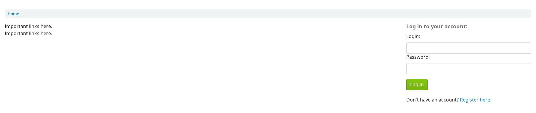
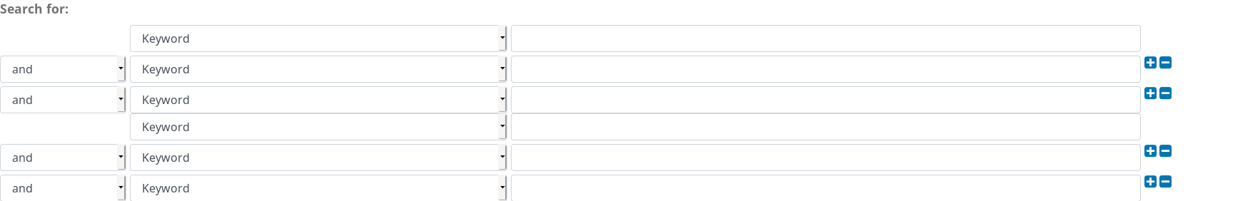
--- Comment #22 from Jonathan Druart <[email protected]>
---
1. https://snipboard.io/9kNAL8.jpg
Don't you think the login inputs are too wide?

2. https://snipboard.io/TlIkcu.jpg
The relevance dropdown is too wide

3. https://snipboard.io/apKe35.jpg
Why did you change the order of the filters at the bottom of the adv search
page?


4. https://snipboard.io/vq2I57.jpg
The [+][i] links don't behave correctly. This is the screen after 1 click on
[+]

5. https://snipboard.io/H3xOZK.jpg
I was surprised by the brightness of the green and noticed that there is a
change.
Compare the "Go" button (in the header):
background-color: #85ca11;
background-image: linear-gradient(180deg,#85ca11,#77b50f);
background-position: 0;

With now:
background-color: #71ac0e;
background-image: linear-gradient(180deg,#7dbf0f,#71ac0e);
border-color: #61940c;
box-shadow: 0 0 0 1px #7dbf0f;

Is that expected?

--
You are receiving this mail because:
You are watching all bug changes.
_______________________________________________
Koha-bugs mailing list
[email protected]
https://lists.koha-community.org/cgi-bin/mailman/listinfo/koha-bugs
website : http://www.koha-community.org/
git : http://git.koha-community.org/
bugs : http://bugs.koha-community.org/