On 06/12/11 00:52, Matthew Revell wrote:
>  * Huw: investigate if using media queries and responsive design
> techniques could solve the wide-screen versus narrow screen issue.
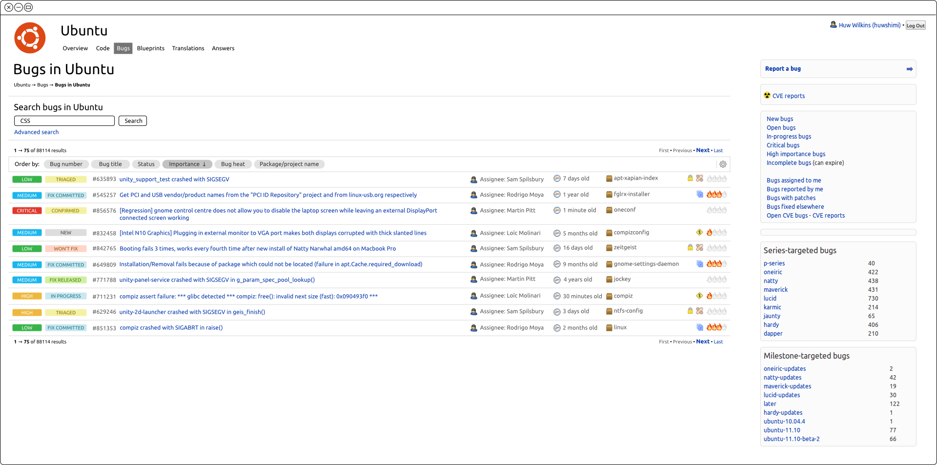
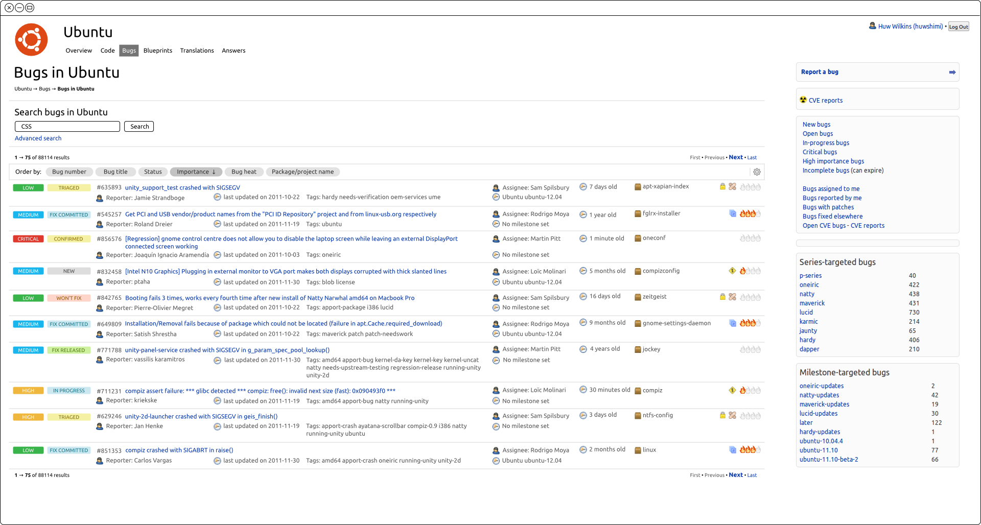
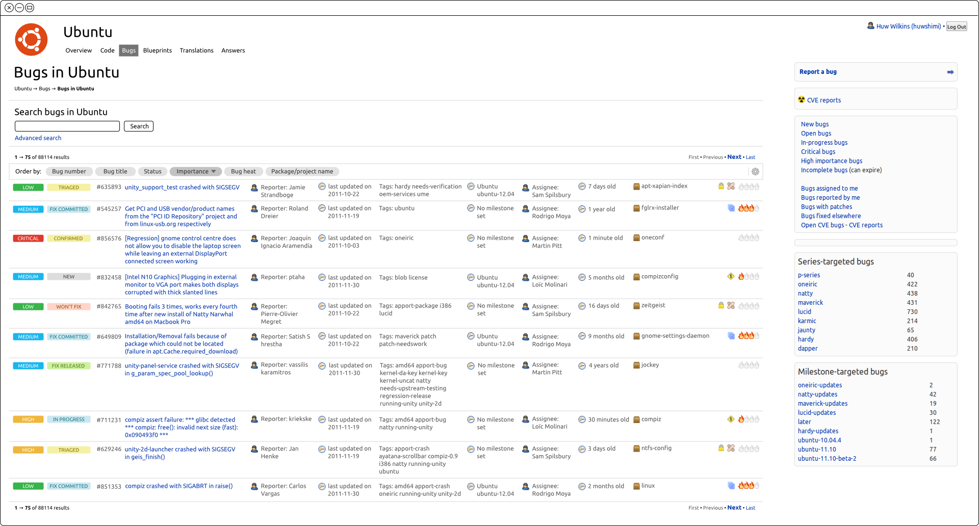
I have spent some time looking into this and here are a few of my
findings. For the mockups I've used the maximum screen resolution that
appears in our analytics which is 1920 wide (approximately 17% of our
users).

Users are telling us that having a second row of content means more
scrolling than with the old style tables and that they would like to see
table columns instead of content below the title.

At the maximum resolution we can add about three extra columns with
minimal wrapping of titles:
http://people.canonical.com/~huwshimi/widescreen/widescreen1.png
<http://people.canonical.com/%7Ehuwshimi/widescreen/widescreen1.png>.

The question is what to do when there are more fields (or smaller screen
resolutions)? For these examples I'm still using the maximum resolution
and all the customisable columns are visible.

We could wrap the extra columns onto a new line:
http://people.canonical.com/~huwshimi/widescreen/widescreen3.png
<http://people.canonical.com/%7Ehuwshimi/widescreen/widescreen3.png>

We could break the cell contents onto new lines:
http://people.canonical.com/~huwshimi/widescreen/widescreen2.png
<http://people.canonical.com/%7Ehuwshimi/widescreen/widescreen2.png>

Both options force us to have two lines for the content as well as
introducing readability issues.

>From this we can see that for almost all combinations of screen
resolution and number of extra fields each bug will take up more than
one row.

Even using responsive design it looks we're not going to be able to
solve the scrolling problem once users start customising the information.

One thing that table columns provide is separation of content. Even if
the content is broken onto multiple new lines there is clear separation
between the bug title and other information.

So, is this possibly the crux of the feedback? Are the new style of
columns not readable enough once extra information is visible? Should we
invest some time into looking at how we are displaying that extra
information (fonts/colours/spacing etc.)?

Cheers,

Huw
_______________________________________________
Mailing list: https://launchpad.net/~launchpad-dev
Post to     : [email protected]
Unsubscribe : https://launchpad.net/~launchpad-dev
More help   : https://help.launchpad.net/ListHelp