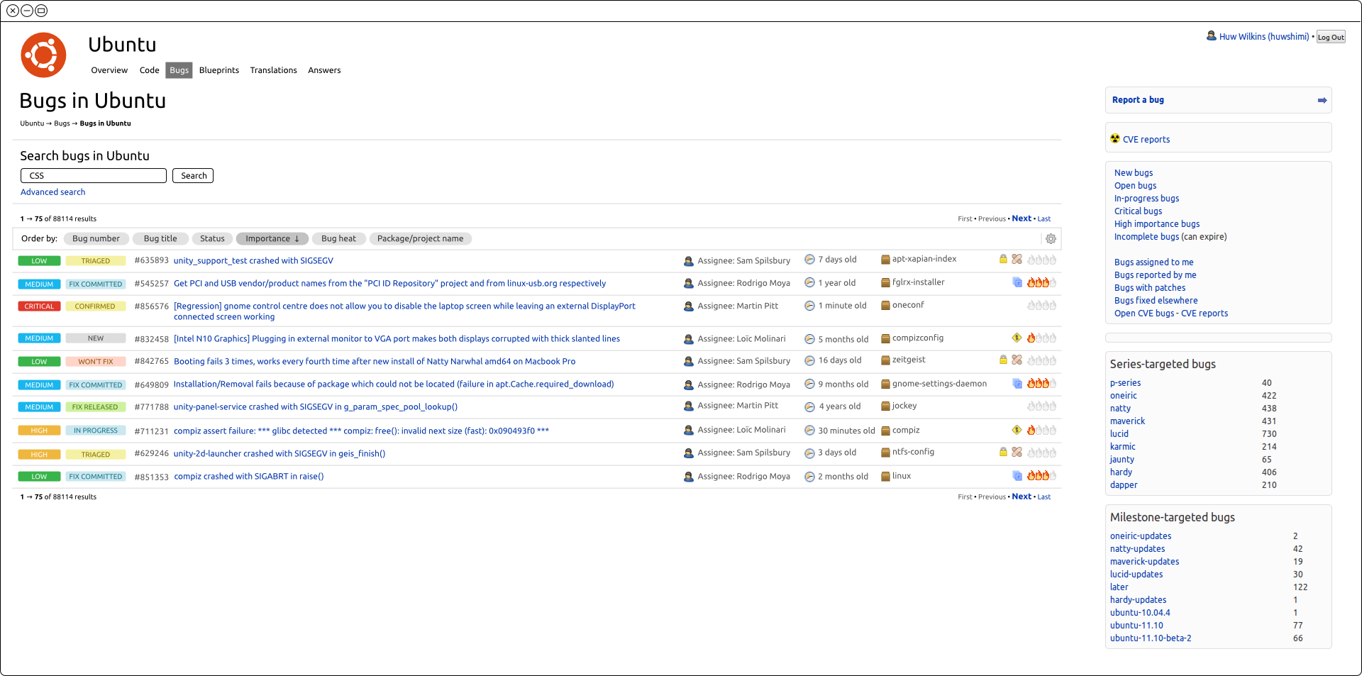
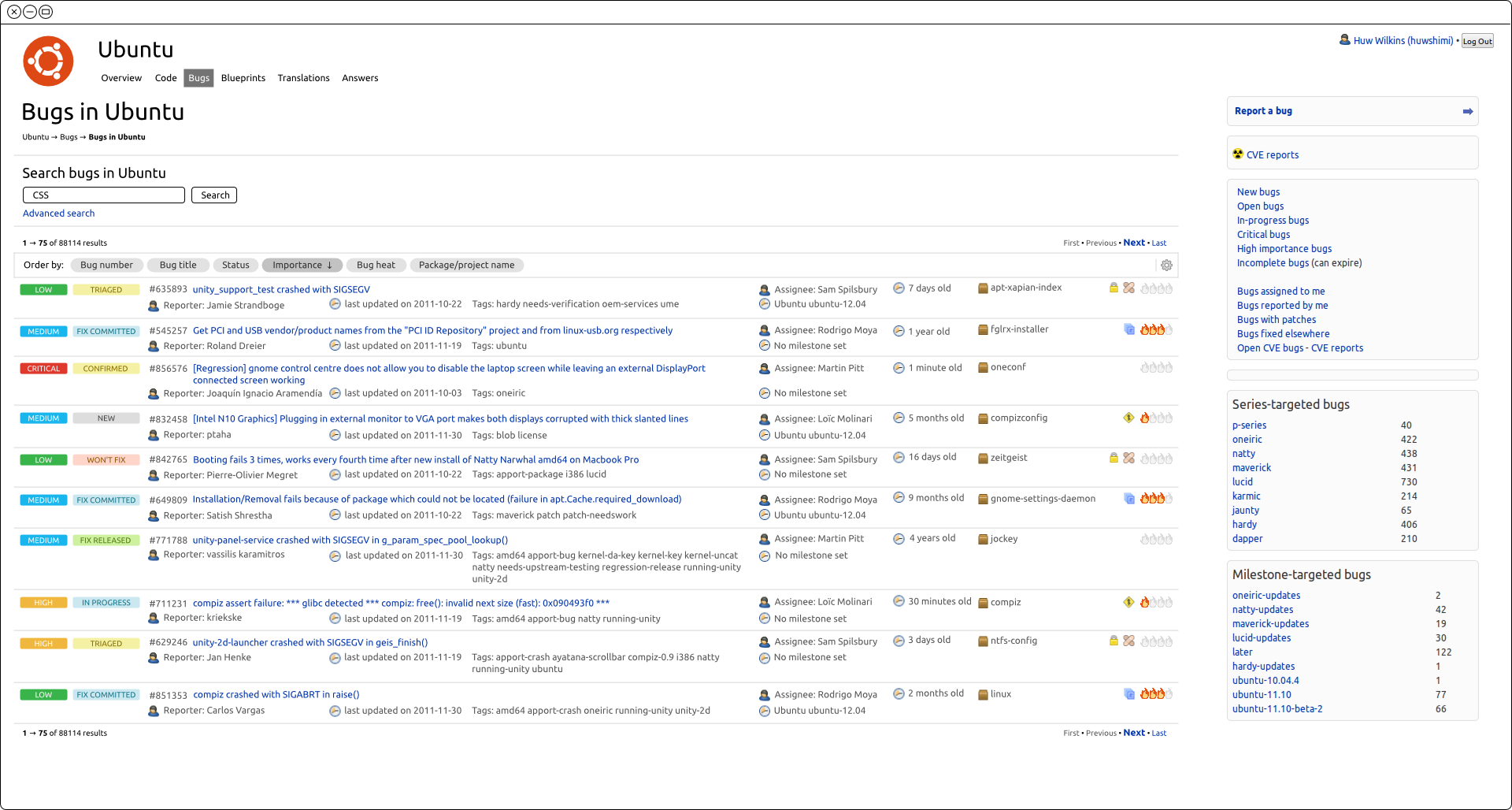
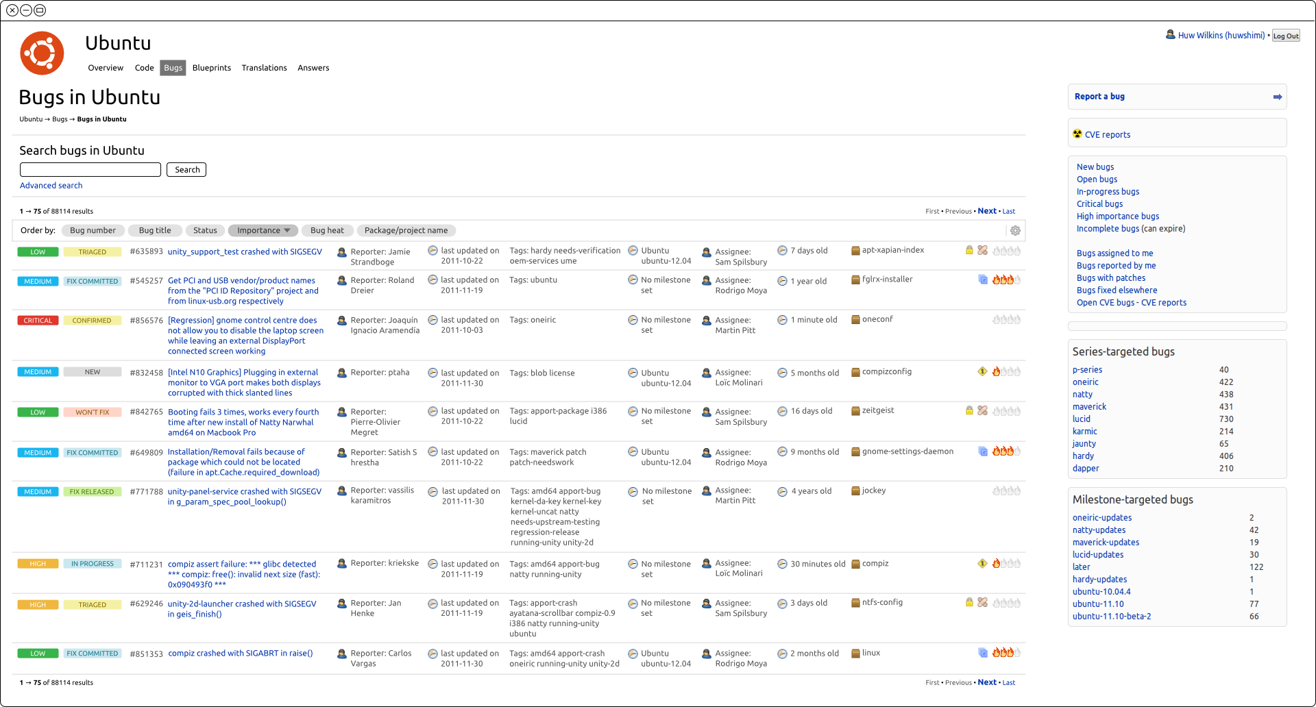
On Thu, 08 Dec 2011, Huw Wilkins wrote:

> On 06/12/11 00:52, Matthew Revell wrote:
> >  * Huw: investigate if using media queries and responsive design
> > techniques could solve the wide-screen versus narrow screen issue.
>
> I have spent some time looking into this and here are a few of my
> findings. For the mockups I've used the maximum screen resolution that
> appears in our analytics which is 1920 wide (approximately 17% of our
> users).
>
> Users are telling us that having a second row of content means more
> scrolling than with the old style tables and that they would like to see
> table columns instead of content below the title.
I get the impression that we'd be better served by focusing on "information
density" vs just the goal of one row vs two rows. They currently get two
rows on some bug titles as they expand in their current table cell. Their
goal is to get as much data into their view as possible, and that includes
some of the new data available to them via this update.

> At the maximum resolution we can add about three extra columns with
> minimal wrapping of titles:
> http://people.canonical.com/~huwshimi/widescreen/widescreen1.png
> <http://people.canonical.com/%7Ehuwshimi/widescreen/widescreen1.png>.

If we keep with the idea of "information density" I can't help but feel
like the way some of the data is presented wastes space. In this
screenshot, for instance, there's a person icon, the description text
"Assignee: " and then the name. This is true of a few other fields and I
wonder if there's not a way to allow the user to hide that information for
the sake of more meaningful content in front of their eyes. These are
mostly the power users out there, and they can probably tell just by the
contents that which data is there.

The other idea would be to try to give them back some sort of header row
that can identify the columns at the top/bottom without forcing the extra
content in the data rows themselves.

If we could surround the extra info in a span, or perhaps another tag with
some better semantic meaning, that could then be hidden via a single
setting in the options with a pure css change across all of the fields.

>
> The question is what to do when there are more fields (or smaller screen
> resolutions)? For these examples I'm still using the maximum resolution
> and all the customisable columns are visible.
>
> We could wrap the extra columns onto a new line:
> http://people.canonical.com/~huwshimi/widescreen/widescreen3.png
> <http://people.canonical.com/%7Ehuwshimi/widescreen/widescreen3.png>
>
> We could break the cell contents onto new lines:
> http://people.canonical.com/~huwshimi/widescreen/widescreen2.png
> <http://people.canonical.com/%7Ehuwshimi/widescreen/widescreen2.png>
>
> Both options force us to have two lines for the content as well as
> introducing readability issues.
>
> >From this we can see that for almost all combinations of screen
> resolution and number of extra fields each bug will take up more than
> one row.
>
> Even using responsive design it looks we're not going to be able to
> solve the scrolling problem once users start customising the information.

I think that we can help users and perhaps get closer to meeting the 90%
needs vs the 80%. There's always going to be the use case of adding
everything to the view and a screen not big enough to show it all on one
line. There's no getting around that by the fact that we're providing more
data to the user than before. You can't expect to get the exact same view
that existed in the old style.

I'm a bit late to the game, but did we look at providing a live update to
the bug view as users were selecting options? Would live rendering the
table as they check/uncheck data to view be something that might help users
see what they can fit/not fit help make them feel a bit more in control of
the view? They can see right away that adding field XXX forces two lines
and it's not worth it to them so perhaps they leave something unchecked
they might have otherwise set just for kicks.

> One thing that table columns provide is separation of content. Even if
> the content is broken onto multiple new lines there is clear separation
> between the bug title and other information.
>
> So, is this possibly the crux of the feedback? Are the new style of
> columns not readable enough once extra information is visible? Should we
> invest some time into looking at how we are displaying that extra
> information (fonts/colours/spacing etc.)?

I think the big thing is that they get no choice for the second row. Even
if they select but number, reporter, and status, they get two lines of
content while there's plenty of room to put that on one line. I don't think
a realistic goal is to provide some view that puts everything on one line,
but to give the user a chance of selecting their own most important data
and getting it in a reasonably condensed view. Using a media query at >
1400px, for instance, would allow us to say cap the bug titles at 66em (or
some number we're aiming to hit) and float the containers for the
status/title info along with trying to float the "extra" data along side it
at the very least.

Rick


_______________________________________________
Mailing list: https://launchpad.net/~launchpad-dev
Post to     : [email protected]
Unsubscribe : https://launchpad.net/~launchpad-dev
More help   : https://help.launchpad.net/ListHelp