Hi,
First of all, when I wrote on my blog the post concerning tabs, i
planned to start a discussion on mailing lists to have feedbacks. I'm
happy that the discussion started by itself (thanks Mox). So any
feedbacks are more than welcome to help us find a good solution.
Concerning the look of tabs, I still don't know which one we should use.
Maybe Eric Bachard, Philip Lohman and Sebastien Plisson can have an
answer from Apple engineers for the most "aqua" choice as they are at WWDC.
I totally agree with the 2nd point of Christian Jansen proposition
("Then redesign and reduce the number of tabs for all platforms."). I
think this will be very profitable for all platforms, and is necessary.
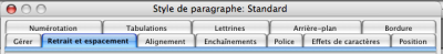
Indeed, users can be lost with the great numbers of tabs of certain
dialogs, and they may not know where to find a particular option. So
they may think this option doesn't exist although it is in the 11th tab
(out of 17) of foo dialog (i exaggerate a bit ;-) ). So, it could be a
very good thing to reduce the numbers of tabs and to improve the names
of some tabs which could be a bit confusing. The layout of some tab
panes could also be improved.
In conclusion, I'm happy that my work on tabs has enabled a discussion
to start concerning user interface, and what's great is that all
platforms will profit from it, not only the aqua port.
Ismael MERZAQ
Maybe a two step solution makes sense here.
1. For the first release the two line version should be ok, even with
the older look. Like shown in
http://lebasket.free.fr/blog/images/tabsOOo2mini.png

2. Then redesign and reduce the number of  tabs for all platforms.

Best,
Christian
---------------------------------------------------------------------
To unsubscribe, e-mail: [EMAIL PROTECTED]
For additional commands, e-mail: [EMAIL PROTECTED]