On Wed, Oct 15, 2008 at 9:14 AM, Dave Neary <[EMAIL PROTECTED]> wrote:
>
[snip]
>
> The disagreement is in the priority & size of the various visual
> elements, some argument over placement of things & so on, but we've been
> steadily converging. There are a couple of hold-outs (I'm holding out
> for some nice big links, Quim is holding out against, Jaffa is holding
> out for "Documentation" and "Report a bug" links, I'm holding out for
> "Development" or "Developer" to hold all the developer documentation,
> and "Get help" to hold all the user troubleshooting-type documentation),
> but we seem to be close to convergence.
I'm certainly closer to your opinion :-)
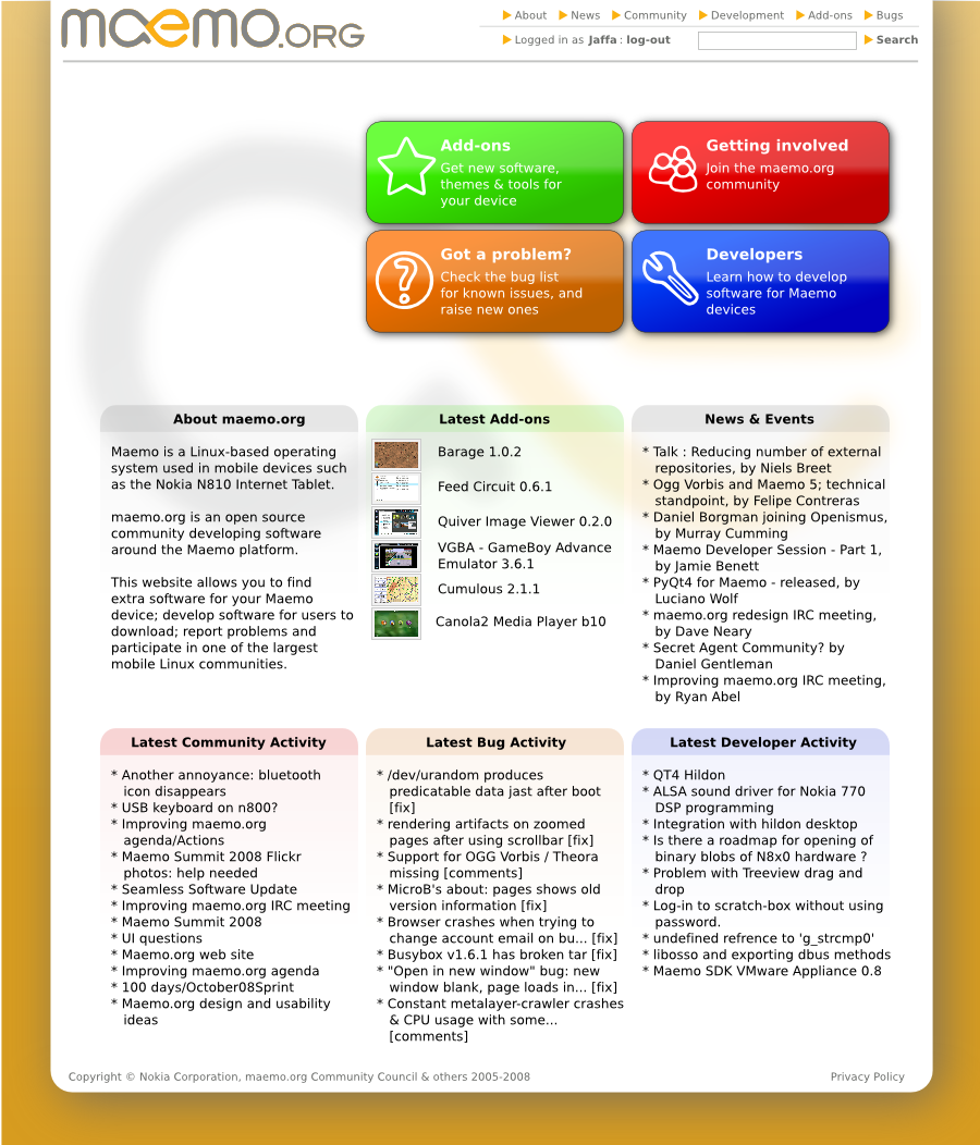
I agree (with you, at least), that the primary links for the homepage
should be to spirit the user away to a more focused page. I still
think the four boxes on my original design[1] (based on your use
cases) cater for that best of all:
* Add-ons/downloads - straight-forward
* Get involved - some new(ish) community introduction page,
links & portal; info on maemo-community etc.
* Got a problem? - a page containing links to pages in a particular
category in the wiki, top-bugs in Bugzilla,
information on maemo-users/ITT, a guide to
searching Bugzilla & a link to the guided report-
an-issue form.
* Developers - similar kind of homepage to the "Get involved
(community)" one; containing definitive links to
current API docs on maemo.nokia.com, syndicated links
to pages in Category:Development in the wiki; info
on maemo-developers
"Got a problem" is a little cross-cutting (developers and community
have components in Bugzilla too), but this is primarily focused on
user problems (without ruling out other use-cases coming to that
section of the site).
I also agree with Quim that the homepage shouldn't be too static, but
I *don't* think we have to turn it into something which is primarily
focused on the downloads & news as a priority; and that those elements
should be used to show the page isn't static, and the community is
active.
Therefore, I strongly believe the purpose of the homepage should be
(in decreasing order of priority):
1) Helping people get to the appropriate part of the site (from
there they can get to other appropriate websites like
forum.nokia, maemo.nokia, ITT, etc.)
2) Showing that there's lots of extra stuff you can add to your
tablet.
3) Showing that the community is active (and what it's active
around (ideally) - but noone seemed to much like my "swarming"
concept).
Other things I think are essential in the overall design:
* A common banner to the above places
* A common banner containing a search box
* A common banner including login information
* A common footer containing a (c) statement recognising it doesn't
all belong to Nokia.
* A common footer indicating maemo.org is sponsored by Nokia.
Cheers,
Andrew
[1] http://www.bleb.org/software/maemo/maemo-org_mockup.png
--
Andrew Flegg -- mailto:[EMAIL PROTECTED] | http://www.bleb.org/
maemo.org Community Council member
_______________________________________________
maemo-community mailing list
[email protected]
https://lists.maemo.org/mailman/listinfo/maemo-community