All,
A little "creative" rearranging:
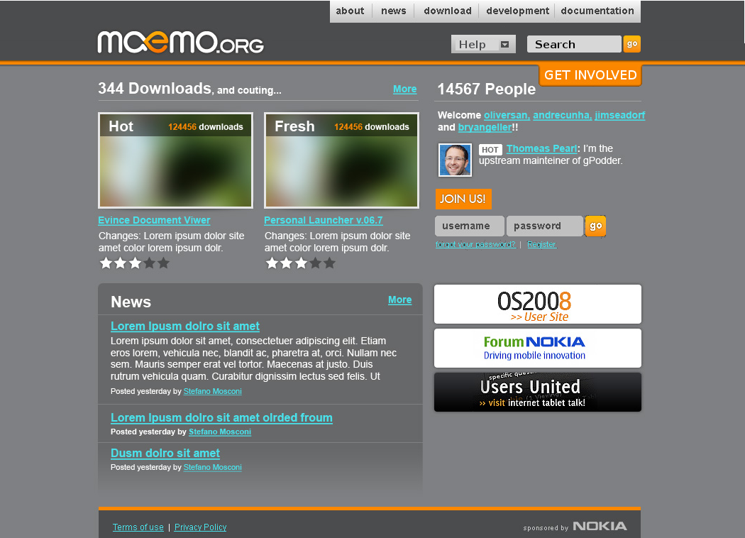
http://samoff.maemobox.org/maemo_redesign/samoff-variation_on_andres_HOMEB.png[1]
*More work needed, of course, I just didn't have the time right
now:
*maemo.org logo needs more headspace (padding).
*Login/Search might look better if they spanned the width of the
right sidebar. *Didn't fix any of the typos, etc.
*Made the "footer" span the width of the page.
*Jussi, I put the other site banners on the bottom as you suggested,
but it just didn't look right -- so they stayed where they were.
Tim
---
Weblog ~ http://tim.samoff.com
Kidblog ~ http://kc.samoff.com
Photography ~ http://www.flickr.com/photos/timsamoff
Film ~ http://www.youtube.com/timsamoff
----- Original Message -----
Subject: Re: maemo.org redesign
From: Quim Gil
To: "List for community development"
Date: 10/15/2008 1:02 am
Andre's latest mockup http://openbossa.andrecunha.com/HOMEB.jpg
shows a
good evolution. Two concerns still before going into really the
details:
- Too thick header. The best benchmark for this is to load the image
in
your tablet. Any height we can save there is good.
- Too many boxes. I think it gets distressing at some point. Help =
Support and Join Us = Get involved, therefore I propose (again) to
get
rid of those duplicities. More background boxes can disappear just
bu
putting the elements on top of the background.
A first step in that direction:
http://wiki.maemo.org/images/d/d5/Homepage-proposal-4.png
NO INTENTION OF SHOWING FINAL DESIGN! I just plaid with the existing
elements doing cut, paste, scale, invert.
The major changes are the move of login/register from the header to
the
People block (with some design love it can loook sensible and
integrated) and killing (again) the thick buttons that (really,
really)
I don't think that useful just because they are big.
Now there is a slimmer header (more can be done working on nav +
help +
search boxes) and some more clarity.
ext Jussi.H Makinen wrote:
> Hi,
>
> To my eye, Andre's first layout
> (http://openbossa.andrecunha.com/HOME.jpg) has the best looks.
Forcing
> two big download banners to the front page does not seem like an
> elegant solution compared to the original.
They are not banners but pure information bits. When we get the
karmna
for applications - https://bugs.maemo.org/show_bug.cgi?id=2179 - the
HOT
item will be refreshed automatically probably every 3-7 days just
like
the top news get refreshed, while the FRESH will probably change
several
times a day - http://maemo.org/downloads/updated/OS2008/25/
It is the interest of everybody to raise the attention on these apps
to
get more downloads, testing, feedback and ratings. maemo.nokia.com
is
actually very interested on this since you will cherry pick from
there
what is considered most interesting and best, taking into account
the
feedback received on stability etc.
> The main app promotion page
> for users should anyway be at maemo.nokia.com and further down the
> road I can see the application manger itself handling lot's of
this
> "most downloaded" "fresh" etc. stuff. So, why push it here? Not
sure
> who does it serve...
"fresh" in maemo.org might be a lot more fresh than in
maemo.nokia.com
or even the application manager. maemo.org is the frontline where
the
first generation of feedback is received. Many fresh stuff in
maemo.org
will probably never show up in maemo.nokia.com or the application
manager (aka extras).
--
Quim Gil
_______________________________________________
maemo-community mailing list
[email protected]
https://lists.maemo.org/mailman/listinfo/maemo-community
Links:
------
[1]
http://samoff.maemobox.org/maemo_redesign/samoff-variation_on_andres_HOMEB.png
_______________________________________________
maemo-community mailing list
[email protected]
https://lists.maemo.org/mailman/listinfo/maemo-community