There is a lot of wonderful advice here (and I have seen two websites
David designed up close and they are excellent), but I would add one
more point:
*The website designer and you have very similar interests, but they
are not exactly the same. The more they sell you on, the more they
make. And while they may know a lot more about the Internet than you
do, they don't necessarily know more about your business than *YOU
*do, so bear that in mind!
I can only wonder how much my annual sales would currently be if I had
taken the advice of every website designer I hired or talked to over
the years (some of whom have moved on to other professions).
On Wed, Jan 1, 2014 at 4:14 PM, David <[email protected]
<mailto:[email protected]>> wrote:
    Hi everyone, best wishes for 2014 to you all

    As well as building websites I have spent a fair amount of time
    surfing them too, the two do go hand in hand and despite what you
    might think there is a science to a website design and how to keep
    the consumer interested, here's not the place to discuss all that
    fun stuff, besides it will likely bore most of you anyway! I
    wanted to add to some of Ari Kahan's accurate comments.

    So again, I have jotted down a few notes (ok maybe not a few!),
    there's a bit to read so maybe grab a coffee first...�;-)

    So, it's one thing to get them to your site, but then you have to
    try to get them to come back. Different things work for different
    types of sites, but just like the old movie serials of our youth
    the basics of any consumer experience should be to leave them
    satisfied at the end but leave them wanting to come back for more.

    Amazing customer service, speedy deliveries, first rate contact is
    frankly what the consumer ALREADY expects but they also expect a
    surfing experience that is not filled with annoying speed bumps
    along the way.� If there is one thing you should bear in mind when
    it comes to website (design) specially when it comes to a webshop,
    there is no need for you (or your web designer) to be cute! Being
    so different from almost every other standard webshop out there
    just makes your site annoying to use. No it's not fun, awesome or
    clever to be so different (even if you think it is), purchasing
    things for money is not rocket science so please don't make your
    consumer need a degree in it when they visit your website.

    Now sure, you've done it on the cheap because a friend did it and
    it looked great so you, your wife and your cousin's nephew Cletus
    have slapped together a website with letters that blink (because
    you learnt some html back in 1998), massive banners all over it
    (because you've got a free program on your computer so how hard
    can it be), and purple on black with green text is your favourite
    colour so use it everywhere. "And new website? Pfffft! Your
    home-made design has worked all these years so why change it now,
    besides this is not face to face to selling like the good old days
    (love that phrase), and it's not like the real world (well
    actually it IS the real world) and besides you have great stuff
    that everyone wants so design shouldn't matter that much..."

    Well maybe you shouldn't read on because to be honest the consumer
    today has way different expectations for their surfing experience...

      * TWO CLICK purchasing is very important, however these days
        there is no real need to have to force the consumer to
        'sign-up' first either. We both know why you do it (so you can
        get their email to direct market to them), but why not let
        them make the purchase with the least amount of things to fill
        in as possible - as soon as they have committed to pay they
        will happily hand over ALL their details.
      * CONTACT PAGE if it has a form to fill in, try to make it with
        as little information required as possible - do you really
        need to know the writer's mother's maiden name or their dog's
        DNA just to allow them to ask you a question? Develop the
        relationship during the email exchanges not in the contact
        form. Also, if you are going to take money off me then I
        really think it's fair that I know your postal address and
        contact phone number.
      * DO NOT HAVE 'Under Construction' on any part of your site,
        either: your entire site is down for some brief maintenance or
        it is a current website, the fact it needs some work done on
        it should never be pointed out (but should be fixed
        immediately anyway!).
      * ABOUT ME/US PAGE - have one, make it interesting and to the
        point - it's not a diary of your life we want to read just
        what qualifies you to sell me stuff.
      * BE CURRENT - it's now 2014, how many of you have updated your
        website to say (c) 2014 Joe Bloggs Posters? Actually, and this
        is the scary thing....how many of you have updated your
        website's copyright date, EVER?!
      * SITE COUNTERS - I don't care how many people have visited your
        site before I got there, none of us do - only you do - keep it
        to yourself because site counters are so last century!
      * GOOGLE ANALYTICS - the best site counter out there, it's free
        and a MUST have, how else do you know your website is going?
      * MENU - if I click on an item on your menu and it takes me to a
        page that is either not there or 'Under Construction' then
        why-oh-why is it ON the menu?!
      * FIFTY FONTS - unless you think books and newspaper publishers
        got it wrong then you should try to restrict the number of
        different fonts you use on a website to maybe 2 or 3, and
        don't be too cute with the font type just because it looks
        pretty...
      * DO NOT force my browser to open new tabs every time I click on
        something I want to read on YOUR website, but...
      * DO force my browser to open new tabs every time I click on a
        link to some OTHER website (allowing the client to leave your
        site by closing the connection to it is just a NO-NO!)
      * DON'T write content or articles but scan it as a picture to
        load on your website to be read.
      * TEXT SIZE - get it right because I've got money and if I can't
        read about what I am buying you can't see my money.
      * CROSS BROWSER FRIENDLY - yep, there is more than one out there
        and they all don't 'render' (display) websites quite the same.
      * FASHION SENSE - most of you leave it up to your wife to choose
        the colours when it comes to decorating the house, picking the
        furniture or even choosing the right tie for that function
        tonight, so why is it you suddenly develop a sense of fashion
        when it comes to web colours?! Again, there is a lot of
        science that goes into what colours best combine with what...
      * NEWSLETTERS - Absolutely! Keep your existing members up to
        date with a newsletter (which MUST have an opt-out option - in
        almost all countries this is law), but for goodness sake, make
        them interesting and keep them BRIEF! Screeds of writing
        appeals to no-one (except you), throw in a few images too.
        Think of your newsletter like that daily online newspapers you
        now read, NONE of them will have the full article on the
        homepage (unlike most real newspapers), all have a title (some
        with an image) and then intro text with a link to further
        reading. Rule of thumb: your entire monthly Newsletter
        (emailed to your member) should be able to be printed on a
        standard piece of printer paper (and still be readable), if it
        is more than that then I will use a four letter word: EDIT.
        You have nothing to say that is so important half the Amazon
        rain forest needs to be culled...
          o I would recommend using a professional newsletter delivery
            company, these are a cheap and very professional options
            that will allow you to use one of their (many) excellent
            templates, deliver your newsletter to your mailing list
            and provide you with feedback, such as how many were
            opened, what articles were clicked on etc etc - you might
            think you know what your customers like to read but stats
            don't lie...
      * DISCOUNT CODES - (not to be confused with GIFT vouchers, also
        very good, but not as popular as you think). These are great
        way to bring people back, they're instant, can be
        time-restrictive (valid until...) and dependent on the site
        design can also be restricted to certain categories (e.g. 30%
        off 3 sheet posters this week-end etc), these codes can often
        be included in your Newsletters too. They work by allowing
        your client to type in the special code at the check-out and
        it deducts the value automatically - excellent!
      * OUT OF STOCK - Displaying lots of products for sale that is
        also mixed in with products that are actually sold is simply
        poor design and is extremely annoying for the consumer
        (despite all your logic, pop along to Amazon etc and look at
        all their sold outs they display).
      * PAYMENT OPTIONS is a hard one, ideally offer as many as you
        can but reality is many can't afford all the costs that go
        with setting that up - something like PayPal takes care of
        that, they take major credit cards and they don't require your
        client to sign up - your cost is deducted at purchase, there
        is no transaction fees, no minimum monthly costs, no bank fees
        there is no annual SSL fees and so on. Sure, if you have a big
        enough turnover then it is cheaper the other way, but for most
        small dealers it is not - but you need to work that out on a
        case by case basis.
      * FLUFFY DICE AND NEON LIGHTS - if you run a webshop then please
        don't let your web designer try to convince you to add all
        those extra little bells and whistles because it's the latest
        most current design trend - the basics of a retail experience
        hasn't changed: you have what they want and they have what you
        want - so try and exchange those things as quickly and as
        easily as possible. Far too many web designer over complicate
        things because a basic design website isn't as much fun or
        expensive as the geeky one he wants to build you.
      * EXTRAS offer more than just product, maybe have articles,
        info, industry news etc etc - it brings them back, it can
        makes your newsletter interesting (ergo they click to go to
        your website) and, is very VERY good for SEO (Search Engine
        Optimisation). I've gotten to chat with people over the years
        who have some great information in their head but it would be
        even better on their website.
      * TRUST YOUR WEB DESIGNER because once you've checked them out
        and committed then maybe let them do what they do best. Of
        course there are some out there that will remove as much as
        possible from your wallet as possible, this can be a rogue
        industry no doubt about it. But there are some who care about
        the client as much as the design, they will take care of you,
        it will be a personal experience for you well worth paying the
        dollars for. Obviously check them out first because sure, you
        can get a website for $399, but honestly it's a commercial
        website for $399 - but really, what did you expect, ongoing
        support, care and attention..?
      * STOP being a cheap-ass! I understand your site is a
        hobby/semi-commercial website and sure you don't have tens of
        thousands of dollars to spend (nor do you have to) but you
        charge a pretty penny for your product and won't spend a few
        dollars on a good modern website/shop? Personally I love
        seeing $500 items for sale on a $50 website, always fills me
        with confidence to buy...
      * EVOLVE! The internet is evolving fast, as is design...you
        could at least make an effort to try and keep up a little
        better than you have been. Today's consumer/surfer is smarter,
        expects a whole lot more and is far less patient than 5, 10 or
        15 years ago, home-made and/or bad design just doesn't cut it
        any more. Sure you can keep your old design and be happy with
        your lot, eventually your client will move on to better and
        easier places to shop (in some cases they already have). If
        you are happy being that corner hardware store and sit there
        with old Bill, reminisce and chew tobaccy every Saturday along
        with your old wooden drawer where you keep the week's takings
        then that's great...but the bell on the door doesn't ring as
        often as it used to does it does it, specially since that
        whipper-snapper opened his shop with clean shelves, no clutter
        on the floor and one of those new new fangled lectric money
        thingamajigs, and yep, he is smart enough to know he has to
        offer great personal service too...

    I hope the above was food for thought, it's just one man's opinion
    in a room where everyone including the client, has an expert one.
    I probably struck too close to home about some of your sites (none
    were specifically in mind when I wrote this) so I apologise if I
    offended, but you probably would cry if you knew how many people
    gave up on your site as the result of the design or difficulty it
    was surfing/buying something from it.

    Good luck in 2014

    David Rew


    Alan Adler did previously state on 1/01/2014 3:46 AM:
    Dear Mopos WHO BUY FROM websites!

    We've shared a great thread on the pros and cons of building and running a
website.

    Now, would any mopos and mo-pros who spend time surfing - or even better,
actually buying - from existing websites, be willing to share their thoughts
and experiences.

    What makes your favorite sites, your favorites?
    What are a site's must-haves or things you dislike about sites you've
visited?
    What would your dream site be like?

    Thanks in advance for your time.

    Alan Adler
    Museum of Mom and Pop Culture

              Visit the MoPo Mailing List Web Site atwww.filmfan.com
<http://www.filmfan.com>
        ___________________________________________________________________
                   How to UNSUBSCRIBE from the MoPo Mailing List
Send a message addressed to:[email protected] <mailto:[email protected]>
In the BODY of your message type: SIGNOFF MOPO-L
The author of this message is solely responsible for its content.
    Visit the MoPo Mailing List Web Site at www.filmfan.com
    <http://www.filmfan.com>

    ___________________________________________________________________

    How to UNSUBSCRIBE from the MoPo Mailing List

    Send a message addressed to: [email protected]
    <mailto:[email protected]>

    In the BODY of your message type: SIGNOFF MOPO-L

    The author of this message is solely responsible for its content.


--
Bruce Hershenson and the other 29 members of the eMoviePoster.com team
P.O. Box 874
West Plains, MO 65775
Phone: 417-256-9616 (hours: Mon-Fri 9 to 5 except from 12 to 1 when we
take lunch)
our site <http://www.emovieposter.com/>
our auctions <http://www.emovieposter.com/agallery/all.html>
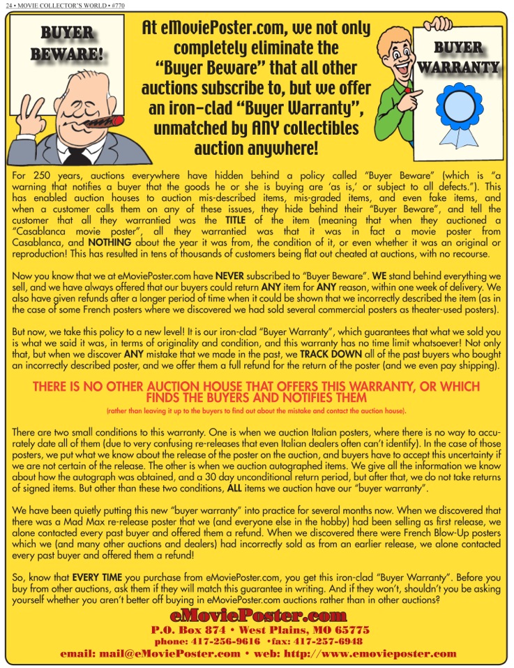
*Complete Buyer Protection
<http://www.emovieposter.com/unused/20120625ad_emovieposter_no_buyer_beware_buyer_warranty.jpg>
- *No time limit on our guarantees & *NO* buyer beware
*Hershenson Help Hotline
<http://www.emovieposter.com/images/announcements/20120906_mcw_ad_hershenson_help_hotline_forsite.jpg>
- *Direct line to Bruce (our owner!) for urgent problems*
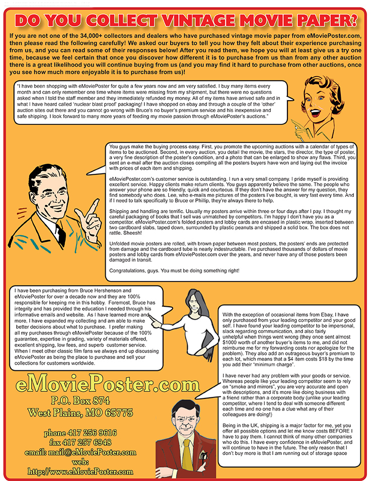
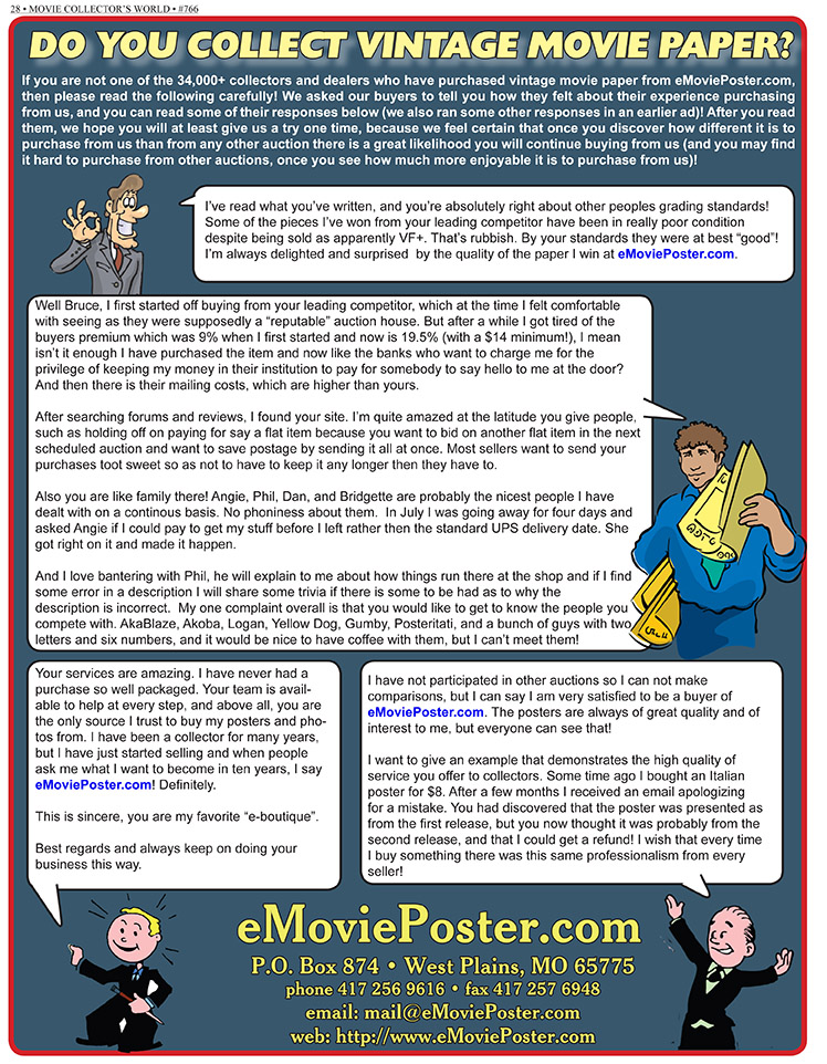
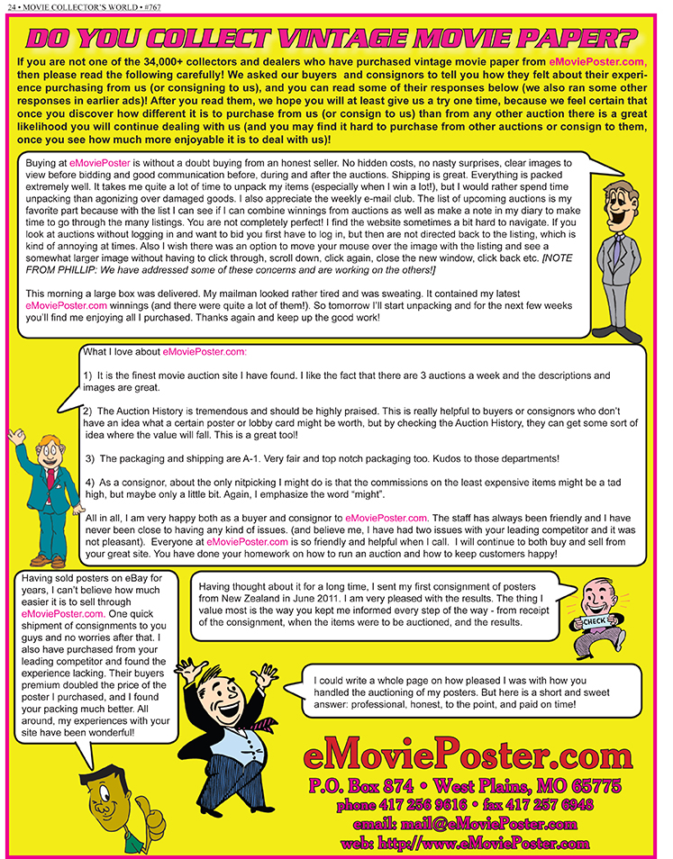
*Also, please read the following three pages of in-depth*Customer
Reviews *of our company *- Page 1
<http://www.emovieposter.com/images/announcements/buyerreviews_page1.jpg>,
Page 2
<http://www.emovieposter.com/images/announcements/buyerreviews_page2.jpg>,
Page 3
<http://www.emovieposter.com/images/announcements/buyerreviews_page3.jpg>*,
which shows you in our customers' own words exactly what makes our
company and our auctions so very different from all others!