1502shivam-singh opened a new issue #212:
URL: https://github.com/apache/apisix-website/issues/212
<h3>Actual behaviour</h3> Currently the website looks fine, but I have some changes to recommend. Currently the animation text in top hero section overflows to 2 lines when “high-performance” (image 1) comes up, and leading words have some margin from left breaking alignments (image 2 and 3) <br></br> <strong>image 1</strong> 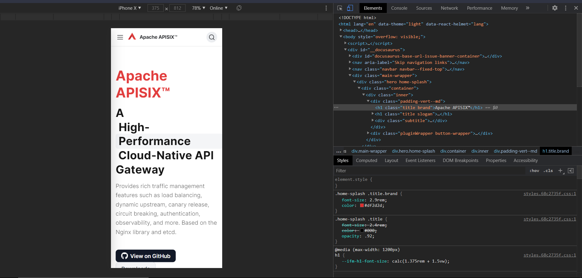 <br></br> <strong>image 2</strong> 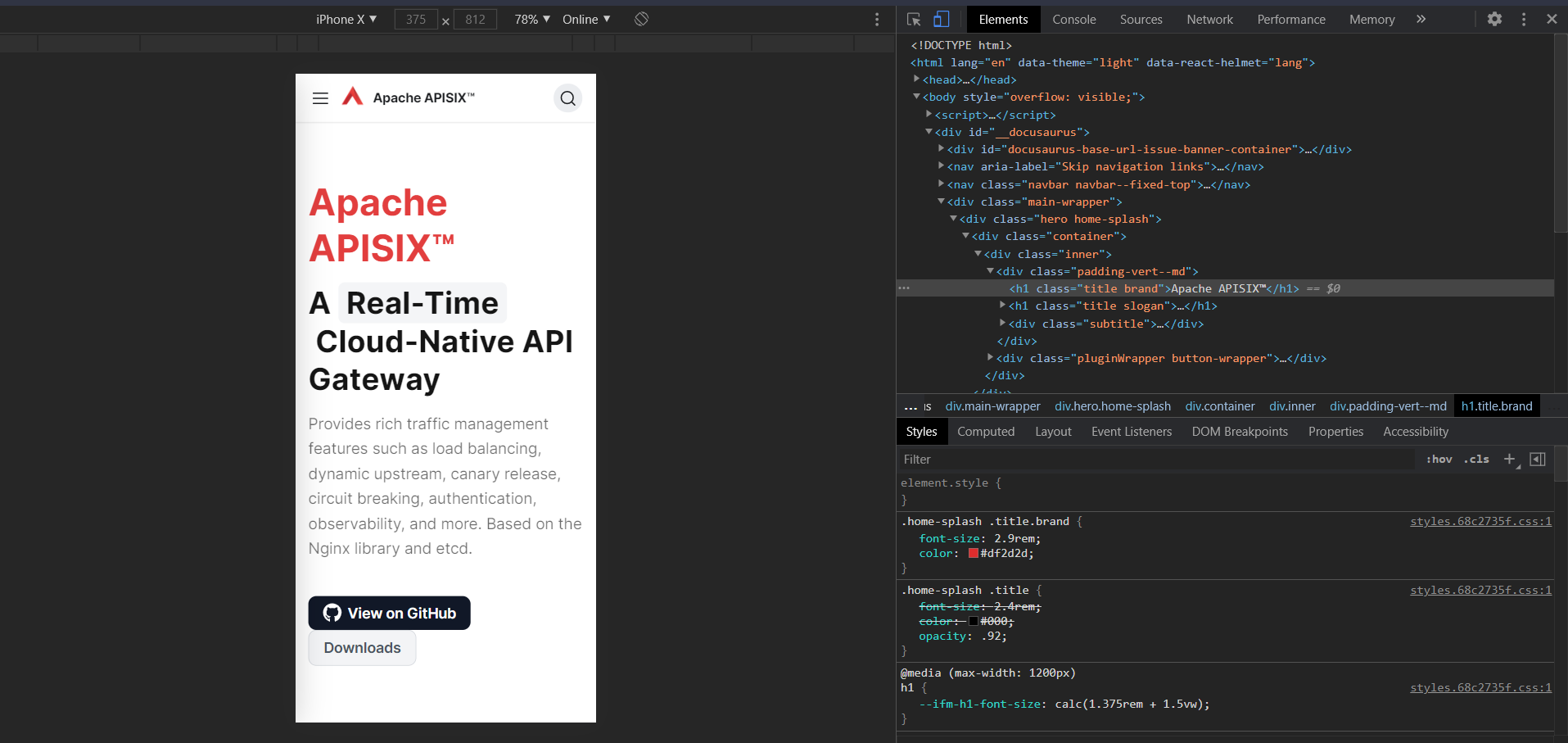 <br></br> <strong>image 3</strong> 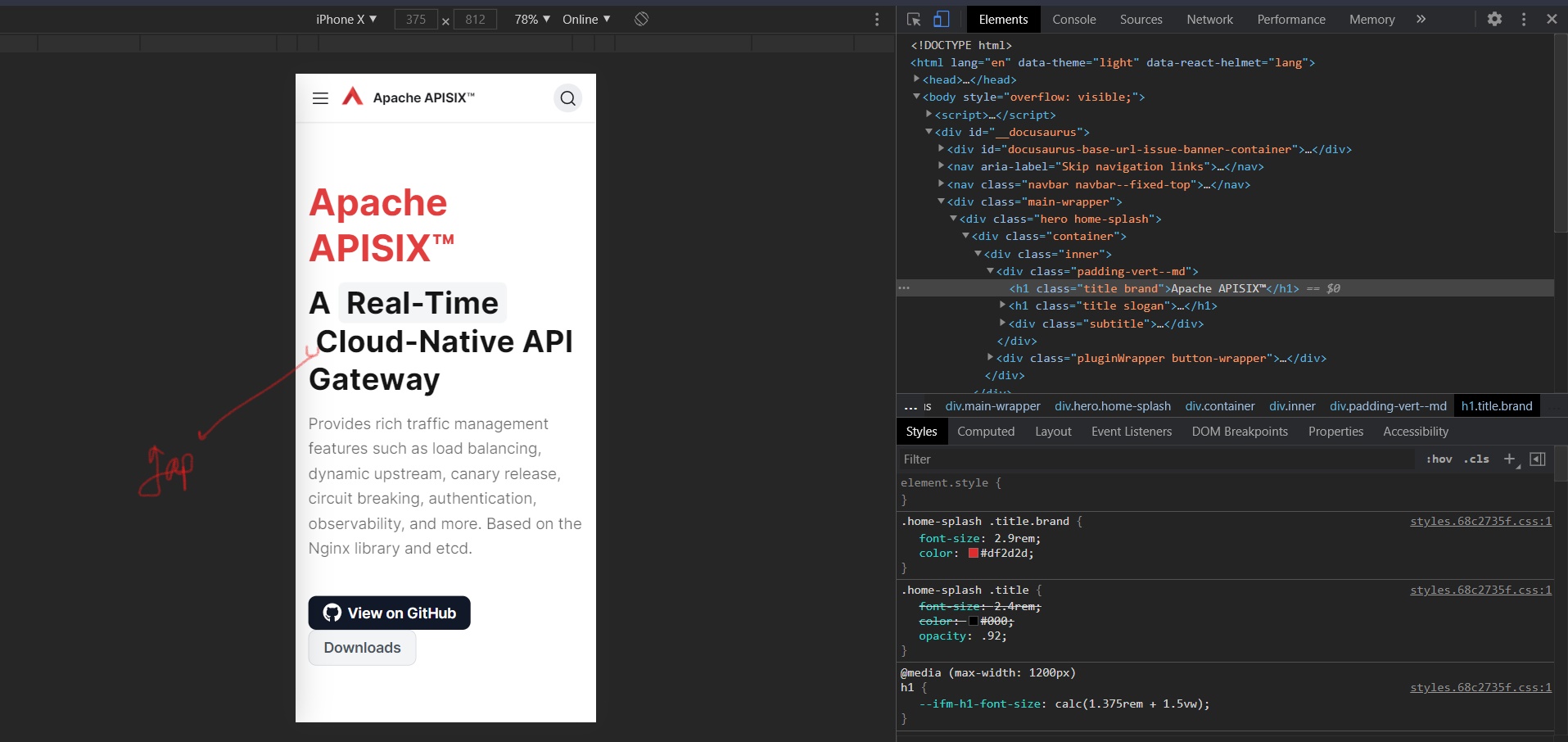 The PNG logo on navbar is pixelated and can be replaced with a SVG logo. (image 4) <br></br> <strong>image 4</strong>  Also the button sizes and spacing on mobile are not appropriate as a bigger size button would be better on mobile for touch and the buttons stick together vertically, here some spacing would be better. (image 5) <br></br> <strong>image 5</strong> 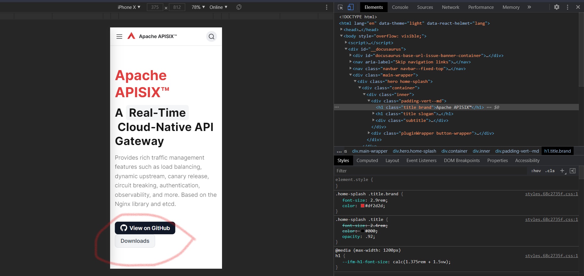 <h3>Expected behaviour</h3> The expected result in the text animation in top hero is to keep the animated word in one single line, because overflow could break the text animation’s grey background leading to not so good results. For the logo, as I have said above a SVG logo would be better as its modern, doesn’t pixelate and saves file size. The buttons should be little bigger, than the current variant with some more padding. Also there should be proper spacing between the buttons to prevent mistouch. <h3>Steps to reproduce</h3> The text animation can be kept in one line by changing the word “high-performance” to a word with same meaning and smaller lexically. I recommend using “Performant” as it’s a synonym of “high-performance” ([source](https://www.wordhippo.com/what-is/another-word-for/high-performing.html)). I personally have tested this word and it fits properly (check image below). For the extra margin a blank space after the space character did the trick. As far as the logo is concerned, I have designed three versions of your org’s logo as a SVG, you can check them here ([Figma link](https://www.figma.com/file/LeICU6ikwITGemfw8lBRs3/APISIX-Apache-swf?node-id=0%3A1)) and tell which one you like. CSS changes will do the trick for the buttons. Appropriate margins and padding. <h3>After change screenshots</h3> Fixing text animations (image 6) and alignments (image 7) (due to margins) - <br></br> <strong>image 6</strong>  <br></br> <strong>image 7</strong> 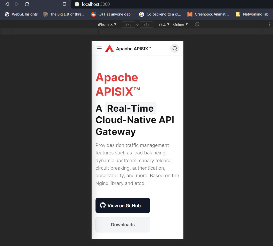 After changing logo to SVG in one of the given options and changing title font-size to match logo size (image 8)- <br></br> <strong>image 8</strong>  Changing button sizes, paddings and spacings (image 9) - <br></br> <strong>image 9</strong>  @juzhiyuan I would like to take up this issue, as I have already done the necessary work to solve this issue. Also, if the figma link doesn't work in your country (maybe) for some reason, then please tell me I will share them here as images. ---------------------------------------------------------------- This is an automated message from the Apache Git Service. To respond to the message, please log on to GitHub and use the URL above to go to the specific comment. For queries about this service, please contact Infrastructure at: [email protected]
