1502shivam-singh commented on issue #212:
URL: https://github.com/apache/apisix-website/issues/212#issuecomment-786859648
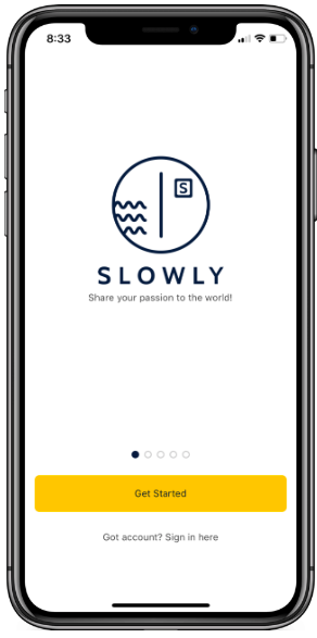
Okay, so you also reduced the font-size for the heading (looks like to me) for high-performance to fit in, I am looking at keeping the original font size as it's better suited for hierarchal difference between the hero text and main heading. The idea of using the `<br/>` tag only on mobile is a good idea 😄 to solve that small gap issue and incidentally I also used this method 😂😂, before stumbling over the fact that a leading space did the trick too. Regarding the full width buttons as I said, usually it's preferred that CTA (call to action) buttons should be less than 70% of the actual mobile device width, specially when you have more than one CTA buttons. Full width buttons are recommended when they are the only action that the user is supposed to take on the whole screen (example - App onboarding screen, you would have seen this too, buttons on bottom are full width).  The less than 70% because consider the situation of a miss-tap when scrolling on mobile. Having some free space with no interactive elements around helps in scrolling. And thanks for attending my small lecture on button user experience design 🤣🤣🤣 ---------------------------------------------------------------- This is an automated message from the Apache Git Service. To respond to the message, please log on to GitHub and use the URL above to go to the specific comment. For queries about this service, please contact Infrastructure at: [email protected]
