1502shivam-singh commented on pull request #214:
URL: https://github.com/apache/apisix-website/pull/214#issuecomment-789019165
@qier222 This one looks good to me. > > > How about this? > > <img alt="CleanShot 2021-03-02 at 16 09 46@2x" width="1425" src="https://user-images.githubusercontent.com/68148142/109617775-c580b700-7b71-11eb-8f24-cf3ac78c688e.png";> For the rest, you designed the page previously, and the buttons were left-aligned previously too with text-centered, so you must have had some thought behind it then. I am just following that flow, what I feel your thought would be is to keep the buttons left aligned because the section itself is left-aligned, the best example of a similar website-hero-section is the stripe website - 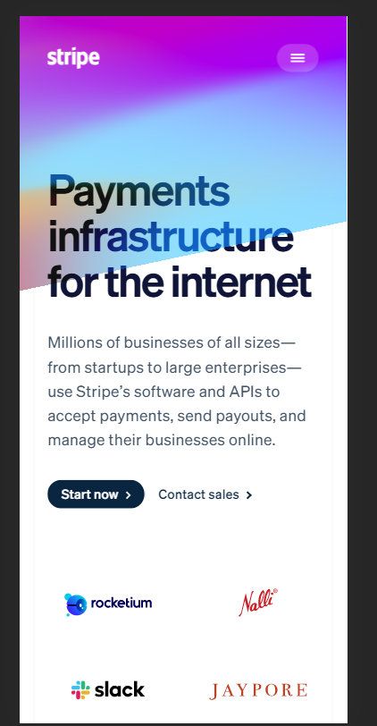 I guess we should first decide on one layout for the hero, then extend further on it. Full-width CTA buttons I have discussed earlier too for left-aligned sections. **This I agree on that a center-aligned hero section would support full-width buttons better** [Github](https://github.com/) website is an example, but they also have it because one field requires an email for which it's full width and the button below it is full width to match the field width for uniformity. Also, something I noticed is when this section is center aligned, the animating text breaks the layout every transition (Try it, you will see), it's just noisy seeing that "A" move around 😣. ---------------------------------------------------------------- This is an automated message from the Apache Git Service. To respond to the message, please log on to GitHub and use the URL above to go to the specific comment. For queries about this service, please contact Infrastructure at: [email protected]