mihir174 opened a new issue #14114:
URL: https://github.com/apache/superset/issues/14114
This proposal outlines a set of guidelines for drag and drop interactions on
the Explore control panel.
### First, why should we use a drag & drop interaction pattern?
- Streamlined workflow order
- Users will not need to drill down into popovers as their initial
action - instead they have the ability to directly manipulate objects that are
already visible in the columns/metrics sidebar
- The columns/metrics sidebar being read-only helps navigate large
datasets, but then demands additional steps to be actionable - eg. re-typing or
re-selecting an identified column or a metric or copying and pasting its name
- Faster workflow when adding multiple metrics and columns
- Fewer clicks for small datasets - It takes fewer steps to add several
metrics for small datasets when all columns and metrics are visible in the
sidebar
- ‘Stickiness’ of sidebar results - It takes fewer steps to add several
metrics for large datasets in cases when a single search term returns multiple
relevant columns and metrics that the user wants to add
- Hierarchical search is less conducive to being contained within a
dropdown menu within a popover than being contained within a sidebar. The
sidebar’s real estate provides better opportunities for presentation of search
results as well as repeated access to the same search results without having to
search twice.
- Delight - the interaction feels light and modern
### Screen recording of main proposed solution:
https://user-images.githubusercontent.com/64227069/114668412-8f2c7080-9cb5-11eb-8331-d22e4f8b4f62.mov
### Breakdown of components and states:
Draggable item (source) - the column or metric item that remains in the
sidebar
Drag item (moving) - the column or metric item that moves with the user's
drag action
Drop zone (valid) - inputs in which draggable items can be dropped
Drop zone (invalid) - inputs in which draggable items cannot be dropped
### Draggable items - Visual/interactive elements & States
<img width="969" alt="Draggable Items - Anatomy Functionality"
src="https://user-images.githubusercontent.com/64227069/114667163-006b2400-9cb4-11eb-990d-e0982a368457.png";>
<img width="991" alt="Draggable Items - States"
src="https://user-images.githubusercontent.com/64227069/114667176-03feab00-9cb4-11eb-8536-f5028a26d8c1.png";>
### Drop zones - Visual/interactive elements & States
<img width="1315" alt="Drop Zones - Anatomy Functionality"
src="https://user-images.githubusercontent.com/64227069/114667256-1b3d9880-9cb4-11eb-82a0-0461fc869d65.png";>
<img width="1184" alt="Drop Zones - States"
src="https://user-images.githubusercontent.com/64227069/114667261-1d9ff280-9cb4-11eb-8f59-9c93760eed61.png";>
### What we have currently (**_++ suggested changes or additions_**)
- On Hover - source item
- Change in color to darker gray
- Hand pointer cursor ++ Open hand cursor
- **_++ Drag handles on metric_**
- On Click
- Standard cursor ++ Closed hand cursor
- On Dragging - drag item
- Ghost state with drop shadow
- **_++ Drag handles_**
- Available drop zones highlighted in blue
- Unavailable drop zones highlighted in red ++ Unavailable drop zones
disabled at 50% opacity
- **_++ Specific drop location indicated with blue box_**
- Reordering supported ++ With visual indicator of shuffling
- **_++ Ability to drag to another available drop zone input in case
user dropped in the wrong place_**
- On Dropping
- ++ Item appears in drop zone for immediate feedback
- Popover appears with immediate error **_++ No unnecessary error until
user exits popover via “Add” or “Done”_**
- **_++ Changed “Add” CTA in metrics popover to “Done”_**
- **_++ Hand pointer cursor to indicate click+drag ability_**
- **_++ Clicking outside popover does not delete the item_**
----------
There were some concerns around the ghost button persisting:
- it may make the control panel appear too busy
- it will add an additional 24px of height for each populated input field
### Alternate solution
https://user-images.githubusercontent.com/64227069/114668613-cb5fd100-9cb5-11eb-9289-e7fdd942735a.mov
Here's an alternative that:
- hides the ghost button as soon as a field is populated
- creates a visual affordance for a drop zone with a blue line +
highlighting drop zones on _hovering_ over a draggable item instead of
_dragging_
Pros:
- saves some vertical space and visual business when we have many inputs
(eg. without dynamic controls)
- less 'jumpiness' of the field expanding when dropping the _first_
column/metric into an input (but there will be the same jumpiness when adding
more than one)
Trade-offs:
- blue line indicator is not an obvious indicator of a drop zone
- misses persistent drop affordance - if the ghost button disappears after
one column/metric is added, it might seem as though the input is 'full' and
will not accept any more columns/metrics
- does not support users with accessibility issues or users who prefer not
to drag and drop
To address the issue of a weak indicator, we can support the user with a
tooltip on their first time. Here's an example:
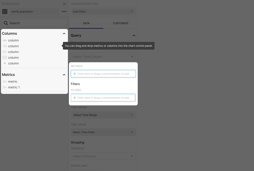
--
This is an automated message from the Apache Git Service.
To respond to the message, please log on to GitHub and use the
URL above to go to the specific comment.
For queries about this service, please contact Infrastructure at:
[email protected]
---------------------------------------------------------------------
To unsubscribe, e-mail: [email protected]
For additional commands, e-mail: [email protected]