Hi,

My thought too was a Save at the top and bottom however the changes we make
most frequently are located in the middle of the screen.  I think the floating
box is fine with an average resolution as shown in the screencast.  It is
unlikely in our network that staff would be using patron edit on a phone.  I
know tho that we try to ensure functionality across screen size and resolution.
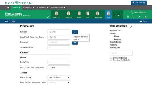
I am inquiring with front line circulation staff about the use of the options
to view required, suggested or all fields.  I do not see those options used
regularly and if they displayed at the top of the patron registration/edit form
it would be fine.  I'll let you know if circulation staff object.

Joan

Joan Kranich
C/W MARS Member Services
[email protected]
508-755-3323 ext. 21


-----Original Message-----
From: Open-ils-general
[mailto:[email protected]] On Behalf Of Kathy
Lussier
Sent: Thursday, July 9, 2015 4:01 PM
To: 'Evergreen Discussion Group'
Subject: [OPEN-ILS-GENERAL] Feedback requested on patron editor in web client

Hi all,

MassLNC has been working with Bill Erickson on a project to move the patron
editor to AngularJS. As with the other pieces of the web client project, we are
looking at maintaining feature parity with the old client.

Bill has begun the work and has created a semi-functional wireframe to
demonstrate the layout of the form. The wireframe brings up one area where an
element that worked well in the xul client may not work so well in the web
client.

In the xul client, we have a floating box to the right of the form where the
Save and Save & Clone buttons are available as well as the options to show
required, suggested or all fields. The floating box follows you along as you
scroll up and down the form so that the Save buttons are always in easy reach.

The same thing happens in the new Angularized editor, but I'm not sure it works
as well in the web client. I think it might be a good time to consider whether
the way we handled this in the old client is the way we should handle it in the
web client or if there are other ways we might be able to provide these options.

I have a screencast showing the current version of the new patron editor.
https://drive.google.com/file/d/0B74gDMUDwDXqM3NjbTZfRjY3RW8/view?usp=drivesdk

At a typical screen resolution, the box with the save options travels with you
without much trouble, although it does get a little awkward when you're
scrolling over the separators with the green background. If you reduce the
screen resolution, we do see a problem where the Save area overlaps with the
input boxes. I don't know how much of a problem this will be since it seems to
work fine at resolutions used by desktops, laptops, and tablets. However, it
could be problematic at resolutions used on phones.

I have a couple of questions:

1. Although I strongly believe the Save and the Save & Clone buttons should be
in easy reach of the user at any location in the patron registration form, I'm
not so sure that the options to view required, suggested or all fields needs to
be there. What do you all think? Are those options that you are likely to click
when you are at different places in the form? Or is it something you set as
soon as you load the form? If it's the latter, I think the top of the patron
registration form might be a nice location for them.

2. Is the floating box the best location for the Save and Save & Clone buttons
or is there some other way we can keep these options in easy reach. When we
first started working on this project, I looked at the mockup Julia Lima worked
on for the Evergreen UI Style Guide project as a reference.
http://media.tumblr.com/69beec7802a938b889bdfa80c7e0d54b/tumblr_inline_nkn0okinXl1t572gy.png

She had placed the "Save" button along the top bar, but I could only see that
working if the top navigation bar in the web client stuck to the top of the
screen. We could certainly place the Save buttons at both the top and bottom of
the screens, but the form is long enough that I could see cases where you would
be in the middle of the form when you hit your save point.

Any ideas on how we might be able to offer easy access to these Save options in
a different way?

Thanks in advance!
Kathy

Kathy Lussier
Project Coordinator
Massachusetts Library Network Cooperative
(508) 343-0128
[email protected]
Twitter: http://www.twitter.com/kmlussier