hpereiradacosta added a comment.
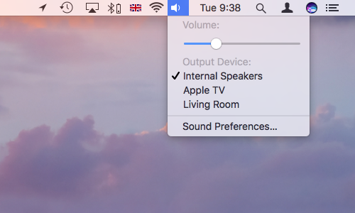
  In D10438#204869 <https://phabricator.kde.org/D10438#204869>, @januz wrote:

  > IMO, the last version looks better than the current menu. That said, I
think the top/bottom paddings are still too tight, I would try adding 2-3px for
each.
  >  It's true that there's a question of taste but more whitespace is
generally a good thing (unless you go overboard and start making huge widgets).
A couple more pixels in the menus will help focus the elements better (by
framing them in negative space), it will make the ui look less "full of stuff"
and less tense.
  >
  > For reference:
  >
  > Material design manual:
https://material.io/guidelines/components/menus.html#menus-usage


  This is a touch based ui.

  > Gnome: http://i.imgur.com/er2odvE.png
  >  Mac:
https://www.intego.com/mac-security-blog/wp-content/uploads/2016/12/Mac-menu-bar-extras-sound.png
  >  Windows:
https://docs.microsoft.com/en-us/windows/uwp/design/controls-and-patterns/menus

  None of these are application's menu. (though I did not check if applications
menus are narrower in these three cases)

  In anycase, increasing margins should then be made consistently accross the
style and not one by one if you want to keep balance.
  For gnome, for instance, see how _all_ margins are larger (and thus
consistent).

  So far, on bugzilla there have been more complains about breeze being too
space-hungry than too dense.
  (I can post the links here if needed)

REPOSITORY
  R31 Breeze

REVISION DETAIL
  https://phabricator.kde.org/D10438

To: zzag, #breeze, #vdg, ngraham, hpereiradacosta
Cc: januz, fabianr, mmustac, abetts, anemeth, plasma-devel, ZrenBot, progwolff,
lesliezhai, ali-mohamed, jensreuterberg, sebas, apol, mart