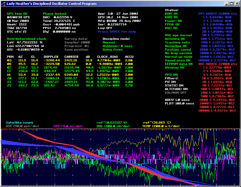
> Hello Said,
>
> Attached is a screen dump of a run that John Miles did.  You can
> see that the envelope of the DAC voltage follows the temperature
> curve (inversely).   On a finer scale the DAC voltage follows the
> PPS error.  This plot was done with the unit locked to GPS.  I
> believe the time scale is 10 secs/pixel (1 hr per major
> horizontal division).
Here's a somewhat-clearer example:
http://www.thegleam.com/ke5fx/day.gif

Each point is 108 seconds, so the entire screen width is about 24 hours.
The yellow temperature and green DAC curves are rather strongly correlated!

-- john, KE5FX


_______________________________________________
time-nuts mailing list -- [email protected]
To unsubscribe, go to https://www.febo.com/cgi-bin/mailman/listinfo/time-nuts
and follow the instructions there.