> I'm not entirely sure about the direction Kin and Kith are taking,
> especially with the whole OSX smackdown - so I'm trying something new with
> the themes, posting mockups of the new directions the theme could go
> flailing into. When I hit something half-decent, I'm going to develop it
> similarly to Kith/Kin, but I'd like to know I'm getting warmer first. If you
> post links to other themes, I'll try to incorperate what you like, wether I
> personally like it or not!
>
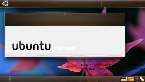
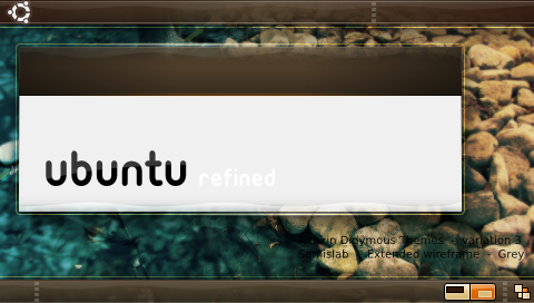
> Below are with different backgrounds...
> http://i4.photobucket.com/albums/y111/raraken/kin_piano_kith.png
> http://i4.photobucket.com/albums/y111/raraken/kin_piano_grass.png
> http://i4.photobucket.com/albums/y111/raraken/kin_piano_leaf.png
> http://i4.photobucket.com/albums/y111/raraken/kin_piano_rocks.png
>
> With buttons...
> http://i4.photobucket.com/albums/y111/raraken/kin_piano_btns.png
>
> The main difference is that I've broken the slab, and made the outer rim
> outline protrude even farther from the block while making it more subtle.
> I've also switched to gray for the window contents.
Hi Ken,

The switch to grey instead of pinky brown is a great move. Everything
is much clearer now. The old theme had a drab, greyish look because it
was using so much of that same colour and had too little contrast
between text and backgrounds compared to a typical reading material
such as paper. (We should really think of reading at all times here. I
think readability is why we should also avoid transparency-hungry
themes like the plague).
It pleases me that these background colours all look good! The theme
has a very subtle way of bringing them out.

Quick thought: It seems odd for the panels to have that glowy rim as
well as normal windows. Perhaps it could be removed for docks. I
imagine that rim getting in the way with maximized windows, and I
think this style works best in smaller chunks. When it's all over the
top and bottom of the screen, it is (to me) overwhelming.

What is the thought on a Metacity theme? Can we do alpha stuff with
those yet, now that Metacity does compositing?

Little plus: This is what the fancy GDM theme that looks nothing like
the actual desktop has always seemed to hint at. To have the desktop
actually be beautiful enough that the login screen looks just like it
will be a huge step forward :)

Bye,
-Dylan

--
ubuntu-art mailing list
[email protected]
https://lists.ubuntu.com/mailman/listinfo/ubuntu-art