On Sat, Jul 26, 2008 at 3:50 PM, Ken Vermette <[EMAIL PROTECTED]> wrote:
> I'm not entirely sure about the direction Kin and Kith are taking,
> especially with the whole OSX smackdown - so I'm trying something new with
> the themes, posting mockups of the new directions the theme could go
> flailing into. When I hit something half-decent, I'm going to develop it
> similarly to Kith/Kin, but I'd like to know I'm getting warmer first. If you
> post links to other themes, I'll try to incorperate what you like, wether I
> personally like it or not!
>
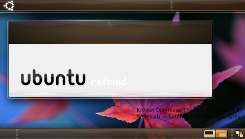
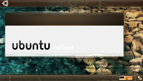
> Below are with different backgrounds...
> http://i4.photobucket.com/albums/y111/raraken/kin_piano_kith.png
> http://i4.photobucket.com/albums/y111/raraken/kin_piano_grass.png
> http://i4.photobucket.com/albums/y111/raraken/kin_piano_leaf.png
> http://i4.photobucket.com/albums/y111/raraken/kin_piano_rocks.png
>
> With buttons...
> http://i4.photobucket.com/albums/y111/raraken/kin_piano_btns.png
>
> The main difference is that I've broken the slab, and made the outer rim
> outline protrude even farther from the block while making it more subtle.
> I've also switched to gray for the window contents.
>

It's looking very nice.  The glowy-rim effect on the windows is a nice touch
and is a great direction to take.  The only suggestion I have at this point
is to make sure there's enough contrast on the close, etc. buttons.  On my
laptop, they can be somewhat hard to see at certain angles.
--
ubuntu-art mailing list
[email protected]
https://lists.ubuntu.com/mailman/listinfo/ubuntu-art