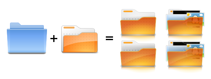
On Mon, Sep 1, 2008 at 9:21 PM, Ken Vermette <[EMAIL PROTECTED]> wrote:
>
>
> On Mon, Sep 1, 2008 at 12:46 PM, Kenneth Wimer <[EMAIL PROTECTED]> wrote:
>>
>> Hi all,
>>
>> I think that for a first try this is pretty good. The highlight gradient
>> at
>> the bottom could be less saturated at the first stop and perhaps a bit
>> more
>> subtle - I know that is getting picky but it is one very important part
>> that
>> we don't want to lose. One very tricky part of making folders is making
>> small
>> version which work well and look similar to the large versions. My
>> experience
>> has shown that making a small version while making the big version keeps
>> things within the bounds of possibility.
>>
>> I will try to scrounge up some of the other folder variants we made for
>> Oxygen
>> a couple of years ago and post them to the list.
>>
>> --
>> Ken
>>
>> --
>> ubuntu-art mailing list
>> [email protected]
>> https://lists.ubuntu.com/mailman/listinfo/ubuntu-art
>
> As per a smaller version, a re-make in the older flat style might be more
> visually appropriate.
> Anywho, mark 2. I also threw in some gloss versions in there. I have no idea
> if the thumbnails in the icon are feasable at this point, but nonetheless
> they are there.
>
>
> http://i4.photobucket.com/albums/y111/raraken/example_mk2.png
>
> --
> -Ken Vermette
>
> --
> ubuntu-art mailing list
> [email protected]
> https://lists.ubuntu.com/mailman/listinfo/ubuntu-art
>
>
I like that a lot. If we can flip the folder around so the top lip
thing is in the left, the thumbnails will be much more visible.
Another option would be to put the thumbnail on top and add a drop
shadow... if the transparency thing doesn't work.

--
David Mikucki

--
ubuntu-art mailing list
[email protected]
https://lists.ubuntu.com/mailman/listinfo/ubuntu-art