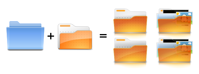
Ken Vermette wrote:
> On Mon, Sep 1, 2008 at 12:46 PM, Kenneth Wimer <[EMAIL PROTECTED]
> <mailto:[EMAIL PROTECTED]>> wrote:
>
>     Hi all,
>
>     I think that for a first try this is pretty good. The highlight
>     gradient at
>     the bottom could be less saturated at the first stop and perhaps a
>     bit more
>     subtle - I know that is getting picky but it is one very important
>     part that
>     we don't want to lose. One very tricky part of making folders is
>     making small
>     version which work well and look similar to the large versions. My
>     experience
>     has shown that making a small version while making the big version
>     keeps
>     things within the bounds of possibility.
>
>     I will try to scrounge up some of the other folder variants we
>     made for Oxygen
>     a couple of years ago and post them to the list.
>
>     --
>     Ken
>
>
> As per a smaller version, a re-make in the older flat style might be
> more visually appropriate.
> Anywho, mark 2. I also threw in some gloss versions in there. I have
> no idea if the thumbnails in the icon are feasable at this point, but
> nonetheless they are there.
>
>
> http://i4.photobucket.com/albums/y111/raraken/example_mk2.png
>
> --
> -Ken Vermette
Wow man. Top notch. I might have to get my plan in place faster than I
thought. :) Lets see what Ken W. thinks.

-Cory K.

--
ubuntu-art mailing list
[email protected]
https://lists.ubuntu.com/mailman/listinfo/ubuntu-art