On Wed, 2007-05-16 at 18:36 +0200, Thorsten Wilms wrote:
[...]
> My buttons however need something to differentiate groups of mutually
> exclusive options.
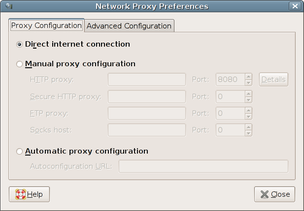
Years ago, the "open look" approach would have been two-fold...
First, an exclusive-choice widget, most likely a drop-down list in
your example because of the relatively long text.  Open look had
clearer guidelines on indicating exclusivity for buttons -- if you
could only make one choice, the buttons touched, with a straight border;
if you could make multiple selections they were further apart, with the
shaded/3d border applied individually.

Second, choosing one of the options for your networking example would
change the set of visible controls in a single lower area, between the
choice and the cancel/reset/reset-to-factory/apply buttons.

The all-choices-visible-at-once approach favoured today has a number of
advantages, including the fact that the user has enough information to
make a better choice at the start without having to try all the options.
"Progressive disclosure" was a US design fad in the 1980s that turned
out to be a mistake if over-applied.

The disadvantage of all-choices-visible is two-fold.  First, dialogue
boxes the size of an aircraft carrier, which dont work at all on
smaller (e.g. mobile) devices.  Second, the controls we have available
don't really lend themselves well to this approach, as you've
discovered.

Microsoft for a while experimented with nested tabbed notebook widgets,
which was a disaster.  You can still see them in the Network control
panel in Windows 98 and XP, for example.

In your network example, though, maybe getting rid of the
Proxy Configuration / Advanced Configuration
distinction would be a useful start.  There's no reason that
an advanced user would not need to configure a proxy and the
label gives no clue as to what's there, so probably most people
will feel they need to look at it, or that they should ask someone
else whether they are allowed in there.

Really, your choices are,
Proxy: automatic / manual / not needed

I imagine (hope) this is part of network profiles, so
the user can easily switch between being at home and at the office
and on the road, without losing settings or having to re-enter proxies
each evening.

Typographically, the really ugly and heavy text input boxes most gtk
themes force upon us become the strongest element in any design,
so you should consider aligning the autoconfiguration box with the
others on the left.  An unfortunate consequence of using indenting
to indicate the hierarchy is the variable distance between the labels
and the entry boxes - right-aligning at the colon would be the obvious
graphic-design fix, with putting the labels on the extreme right instead
of the left being a possible alternative.  If you aligned the
Autoconfiguration URL properly, the silliness of the left-aligned
labels would be even more obvious, unfortunately.  It's what you get
when engineers try to do graphic design :-)  but OK I'll stop ranting.

The upshot of all this is that I think the problem is not in fact
that there's no direct link between the radio buttons in
http://thorwil.files.wordpress.com/2007/05/net_proxy.png
but rather that you're using layout to indicate too many things
at once, and some of them are conflicting with each other.

Try putting the 3 choices at the top, in a group, and all
the controls in a single group.

(I don't actually see why you can't use an
autoconfiguration URI and then override, say, the ftp
proxy manually, by the way, but this is really just an
example)

Liam

--
Liam Quin - XML Activity Lead, W3C, http://www.w3.org/People/Quin/
Pictures from old books: http://fromoldbooks.org/
Ankh: irc.sorcery.net irc.gnome.org www.advogato.org

_______________________________________________
Usability mailing list
[email protected]
http://mail.gnome.org/mailman/listinfo/usability