On Wed, May 16, 2007 at 01:34:36PM -0400, Liam R E Quin wrote:
> On Wed, 2007-05-16 at 18:36 +0200, Thorsten Wilms wrote:
> [...]
> > My buttons however need something to differentiate groups of mutually
> > exclusive options.
>
> Years ago, the "open look" approach would have been two-fold...
> First, an exclusive-choice widget, most likely a drop-down list in
> your example because of the relatively long text.  Open look had
> clearer guidelines on indicating exclusivity for buttons -- if you
> could only make one choice, the buttons touched, with a straight border;
> if you could make multiple selections they were further apart, with the
> shaded/3d border applied individually.
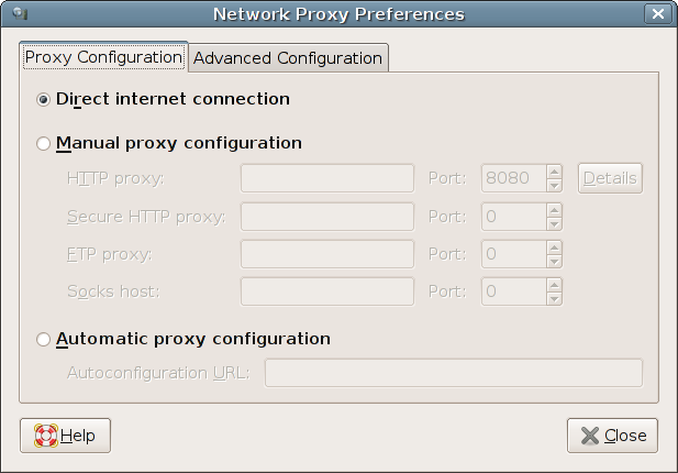
I considered touching vs not touching for the difference, but that
would mean not being able to do compact layouts with check-box-type
options and it doesn't cover the case of radio options with stuff
between them like the proxy config.

> Second, choosing one of the options for your networking example would
> change the set of visible controls in a single lower area, between the
> choice and the cancel/reset/reset-to-factory/apply buttons.

I thought about that briefly and my conclusion is that even the disabled
widgets provide some information and that the connection between options
and settings is most clear this way.


> In your network example, though, maybe getting rid of the
> Proxy Configuration / Advanced Configuration
> distinction would be a useful start.  There's no reason that
> an advanced user would not need to configure a proxy and the
> label gives no clue as to what's there, so probably most people
> will feel they need to look at it, or that they should ask someone
> else whether they are allowed in there.
>
> Really, your choices are,
> Proxy: automatic / manual / not needed
>
> I imagine (hope) this is part of network profiles, so
> the user can easily switch between being at home and at the office
> and on the road, without losing settings or having to re-enter proxies
> each evening.
>
> Typographically, the really ugly and heavy text input boxes most gtk
> themes force upon us become the strongest element in any design,
> so you should consider aligning the autoconfiguration box with the
> others on the left.  An unfortunate consequence of using indenting
> to indicate the hierarchy is the variable distance between the labels
> and the entry boxes - right-aligning at the colon would be the obvious
> graphic-design fix, with putting the labels on the extreme right instead
> of the left being a possible alternative.  If you aligned the
> Autoconfiguration URL properly, the silliness of the left-aligned
> labels would be even more obvious, unfortunately.  It's what you get
> when engineers try to do graphic design :-)  but OK I'll stop ranting.
>
> The upshot of all this is that I think the problem is not in fact
> that there's no direct link between the radio buttons in
> http://thorwil.files.wordpress.com/2007/05/net_proxy.png
> but rather that you're using layout to indicate too many things
> at once, and some of them are conflicting with each other.
>
> Try putting the 3 choices at the top, in a group, and all
> the controls in a single group.


The point of this exercise was applying my ideas to an existing dialog.
Especially one that offers an interesting challenge, a case my concepts
should better cover. So it would have been pointless to change the
structure or any other aspect of the layout


--
Thorsten Wilms

Thorwil's Design for Free Software:
http://thorwil.wordpress.com
_______________________________________________
Usability mailing list
[email protected]
http://mail.gnome.org/mailman/listinfo/usability