I have fixed the vectorizer in knn.  Available from [0]
as org.apache.mahout.knn.Vectorize20NewsGroups
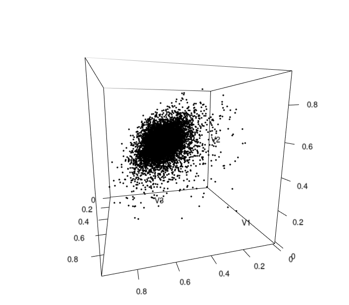
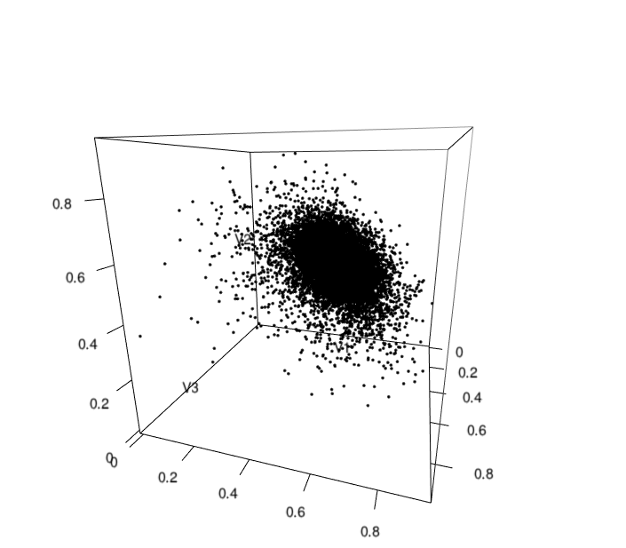
Typical invocation would have these command line options:

   lic subject false 1000 ../20news-bydate-train

These are:

- term weighting code.  lic = log(tf) * IDF with cosine normalization

- which header fields to include (comma separated)

- should quoted text be included?

- number of dimensions to project to

- top-level directory of documents (one doc per file).

The outputs go to two files:

   output - contains a sequence file where the newsgroup is the key and the
value is the document vector.

   output.csv - contains CSV data with newsgroup name, document id and
vector coordinates

Happily, the vectorized forms here can be read into R directly using the
CSV format.  For visualization of these kinds of things, I think that R's
plot function is very nice.    For instance, [1] has a few plots of 10 of
the 1000 dimensions against each other.  Color is according to news group,
term weighting code is lic (log(tf) * IDF, cosine normalized.  We see lots
of axis alignment, also see some color discrimination (green seems to stand
out) and we see various kinds of spoking behavior.  These are the sorts of
things I would expect.   The axis alignment is good because it indicates
that L_1 learning should help here.  The color coding is arbitrary and not
what we really care about at this level of examination.

I also built a small multinomial model on the first 15 components and saw
gratifyingly strong signals on a few of the coordinates.  That isn't the
same as testing on held out data or building a full-scale model, but it is
a good sign.

[0]
https://github.com/tdunning/knn

[1]
https://dl.dropbox.com/u/36863361/plot20.png
https://dl.dropbox.com/u/36863361/plot30.png
https://dl.dropbox.com/u/36863361/plot40.png
https://dl.dropbox.com/u/36863361/plot50.png
https://dl.dropbox.com/u/36863361/plot60.png
https://dl.dropbox.com/u/36863361/plot70.png
https://dl.dropbox.com/u/36863361/plot80.png


On Thu, Dec 27, 2012 at 11:53 AM, Dan Filimon
<[email protected]>wrote:

> Hi!
>
> I'm finally getting back to work on Streaming KMeans! :)
> The last thing I did was experiment with different ways of vectorizing
> the 20 newsgroups data set and I wanted to project them in 3D and
> check out  what I get.
>
> The result is pretty odd, but I get it regardless of the method I use
> to generate vectors.
> It looks like someone splashed a 2D normal distribution on a sphere.
>
> Here's an image from Ted's algorithm [2] and one from mine [3] using
> log term-frequency scoring.
> Ted's uses vectors of size 9000 with hashing (using
> StaticWordValueEncoder) while mine uses vectors of size ~90000 with a
> manual approach.
>
> I think the vectorization actually went okay for both algorithms, but
> maybe the projection is off?
>
> The shape is odd. What am I doing wrong? :/
>
> [1] https://gist.github.com/4391252
> [2] http://swarm.cs.pub.ro/~dfilimon/skm-mahout/ted-projected.png
> [3] http://swarm.cs.pub.ro/~dfilimon/skm-mahout/log-projected.png
>