On 09/06/10 11:28, char101 wrote:
On Jun 9, 2:08 am, nico io<[email protected]> wrote:
Hi,
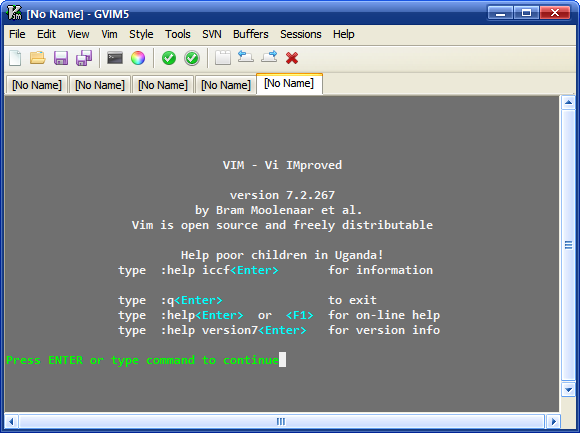
I am currently using Gvim 7.2 rebuild with this new toolbar.
I think :
1. Gvim has to improve its visual interface to seduce new users.
Hi,

Speaking about improving gvim interface (at least for gvim on
windows), I have patched gui_w32.c to...
- using IMAGELIST to store the icons, thus enabling the user of 32-bit
transparent bmp for toolbar icons (on XP upwards only)
and showing the bevel effect on toolbar icons on mouse over (hot-
tracking). This would make it easier to use existing icon theme that
usually comes in PNG. Converting PNG to 8 colors BMP usually results
in bad looking icons, but converting to 32 bit BMP will retains the
icon quality.
- draw the toolbar background as rebar (the gradient on explorer
toolbar on default xp theme)

Changed files (synchronized with latest vim73 branch):
http://sites.google.com/site/chardocs/gui_w32.c
http://sites.google.com/site/chardocs/gui.h

How it looks: http://charupload.files.wordpress.com/2007/12/vim.png
(using fugue icons http://www.pinvoke.com/)
Hm, just for the record, here is what gvim looks like under GTK2, with
the built-in icon set:
http://users.skynet.be/antoine.mechelynck/vim/gvim.png
I guess these "beautiful" icons are part of the reason why I feel no
pressing urge to change them.
The taskbar at bottom is of course not part of Vim, but compare the
"gears" icon at bottom left with the one on the Vim toolbar, above and
slightly to the left of the hjkl diamond in the help.
Best regards,
Tony.
--
"Murphy's Law, that brash proletarian restatement of Godel's Theorem ..."
                -- Thomas Pynchon, "Gravity's Rainbow"

--
You received this message from the "vim_dev" maillist.
Do not top-post! Type your reply below the text you are replying to.
For more information, visit http://www.vim.org/maillist.php