On 12/20/12 6:14 AM, Shenfeng Liu wrote:
> imacat,
>   Your comments are so professional! :-)
>   Personally I like this logo design more comparing to other candidates in
> wiki<https://cwiki.apache.org/confluence/display/OOOUSERS/AOO+4.x+-+Logo+Explorations>.
> Thanks Michael!
>   While we may also want to update the app icon design as the next step for
> consistent L&F...
>
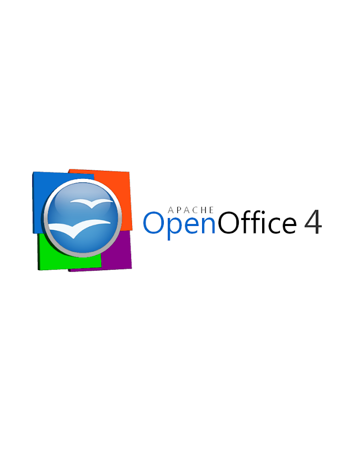
I think Michaels proposal is the beginning of hopefully more. I
personally see a reused old orb + some new elements. But the squares
remind me to windows and the colors don't fit really together from my
point of view.

We should think about something really new and fresh with or without the
gulls.

We should think for what OpenOffice and Apache stands for

- free office software for the public good
- for many million users all over the world
- many languages
- ....

We should think about something that can maybe visualize some of these
attributes and can transport the message in one or multiple combined
graphical elements.

Too bad that I am no designer, but I will try to think about ideas and
will at least share my ideas with you.

Juergen


> - Shenfeng (Simon)
>
>
>
>
> 2012/12/20 imacat <ima...@mail.imacat.idv.tw>
>
>>     Some honest thoughts:
>>
>>      1. These flat 3D plates feel a little weird.  The lights of the
>> plates has the focus effect, but the lights of the plates have not.
>>
>>      2. I cannot see the connection of these plates with our four
>> components easily, as the colors of Writer, Calc, Impress and Base are
>> not Blue, Orange, Green and Purple.  And we have other components such
>> as Math and Draw.
>>
>>      3. The directions of the lights are contradictory.  The lights of
>> the orb come from above, while the lights of the plates (and also the
>> plate of the orb) come from right.
>>
>>     But still, thanks you very much for this great effort.
>>
>> On 2012/12/20 09:33, Michael Acevedo said:
>>> Greetings to the AOO Team!
>>>
>>> Hello, after a few months of inactivity I've decided to get back in touch
>>> with the AOO community. First, congratulations to the AOO team on
>>> a successful graduation into a top-level Apache project from the Apache
>>> Incubator.
>>>
>>> Now the reason on why I am writing this email is to formally submit a
>> logo
>>> proposal for the next version of the Apache OpenOffice 4.X logo.
>>> Previously, I submitted an initial logo on the Apache OpenOffice Google+
>>> community but I went back to the drawing board and created a second
>> version
>>> of the logo that both pays respect to the previous Apache OpenOffice orb,
>>> but modernizes the look of the overall logo by adding 4 colored squares
>>> that represent the four corners of our office suite (Writer, Calc,
>> Impress,
>>> and Base) and utilizing a streamlined font.
>>>
>>> Without further introductions, below I present my official submission for
>>> the Apache OpenOffice 4.X logo.
>>>
>>> This first logo, is the proposed official logo for the project that would
>>> be used for our webpage and some other materials.
>>>
>>>
>> https://lh3.googleusercontent.com/-lETVSrwcgJc/UNJpH6G1sxI/AAAAAAAAABg/JnpNrXdRgUo/s653/AOO%25204%2520LOGO%2520v2-5%2520Small%2520copy.jpg
>>>
>>> There's a secondary logo, which is basically the same logo but changes
>> the
>>> proportion of the OpenOffice orb making it better suited for the splash
>>> screen that appears at the launch of the application.
>>>
>>>
>> https://lh4.googleusercontent.com/-uy8gU24uBZw/UNJpH8UiKiI/AAAAAAAAABk/xfXTQjO8iQg/s912/AOO%25204%2520LOGO%2520v2-2.png
>>>
>>> Hope you guys like it and Happy holidays!
>>>
>>
>>
>> --
>> Best regards,
>> imacat ^_*' <ima...@mail.imacat.idv.tw>
>> PGP Key http://www.imacat.idv.tw/me/pgpkey.asc
>>
>> <<Woman's Voice>> News: http://www.wov.idv.tw/
>> Tavern IMACAT's http://www.imacat.idv.tw/
>> Woman in FOSS in Taiwan http://wofoss.blogspot.com/
>> OpenOffice http://www.openoffice.org/
>> EducOO/OOo4Kids Taiwan http://www.educoo.tw/
>> Greenfoot Taiwan http://greenfoot.westart.tw/
>>
>>
>