Peter Kupfer wrote:
Nicu Buculei wrote:
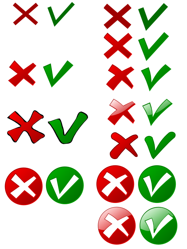
see if you like this:
http://ooo.nicubunu.ro/checkmarks.png
in case you like them but adjustments are needed, here is the source:
http://ooo.nicubunu.ro/checkmarks.svg
I don't know what others think, and I am no artist, but I would like to
see the left hand side of the check a little bit lower than the right
hand side. At this point, IMO, it looks too much like a v.
Other than that, I think they are nice and fit the OOo motif well. Good
work!
i guess you are right. the image is updated now.
--
nicu
my OpenOffice.org pages: http://ooo.nicubunu.ro