I have been sitting here looking at wifi air packet captures off and
on for years now, trying to come up with a representation, over time,
of what the actual airtime usage (and one day, fairness) would look
like. Believe me, looking at the captures is no fun, and (for example)
wireshark tends to misinterpret unreceived retries at different rates
inside a txop as tcp retries (which, while educational, makes it hard
to see actual retries)...
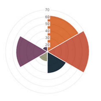
Finally today, I found a conceptual model that "fits" - and it's kind
of my hope that something already out there does this from packet
captures. (?) Certainly there are lots of great pie chart tools out
there...

Basically you start with a pie chart representing a fixed amount of
time - say, 128ms. Then for each device transmitting you assign a
slice of the pie for the amount of airtime used. Then, you can show
the amount of data transmitted in that piece of the pie by increasing
the volume plotted for that slice of the pie. And you sweep around
continually (like a radar scanning or a timepiece's pointer) to show
progress over time, and you show multicast and other traffic as eating
the whole pie for however long it lasts.

conceptually it looks a bit like this:

http://blog.cerowrt.org/images/fairness.png  (I borrowed this graph
from
http://www.webdesignerdepot.com/2013/11/easily-create-stunning-animated-charts-with-chart-js/
)

Another way to do it would be to have the pie represent all the
stations on the network, and to have the "sweep hand" jump between
them...


--
Dave Täht
Let's go make home routers and wifi faster! With better software!
http://blog.cerowrt.org
_______________________________________________
Bloat mailing list
[email protected]
https://lists.bufferbloat.net/listinfo/bloat