Yes, this is exactly the sort of thing I was envisioning and trying to describe.
David Lang

On Tue, 19 Apr 2016, Aaron Wood wrote:
What about a strip-chart with multiple lanes for every device.  Then use
either a line graph or a spectrograph (color of band) style marking to show
data rate used at that time.  If the main goal is fairness and airtime,
then the eye can visually compute that based on how evenly spread out the
slices of usage are, and can identify problematic places based on color of
the band (or height of the line, if using a spark-lines instead of patches
of color.

I've done this in the past to visualize offline devices in a mesh network,
and the result of that was _very_ useful for showing how losing one node
takes out the ones that needed to route through it, also useful for showing
when failures were time-correlated or not.

Multicast messages could then be shown as grey bands across the whole set
of spectrum, and inter-packet as just whitespace (or maybe thin black
lines).

If you were more interested in showing sent vs. received, then you could do
two stripes per station, one for tx and one for rx.

For higher encoding rates, the preamble could be shown in the 1Mbps/11Mbps
color, and then the rest of the payload in a different color for the MCS
used.  That will show efficient aggregation vs. inefficient aggregation.

Hmm...  I kinda want to sketch this up using matplotlib.  I've used a
couple pcap libraries (like scapy) with python.  They're not fast, though
(scapy does about 2500pps in reading/parsing pcap files on my computer).
That might be better if it was told to only parse the radio-tap header and
ignore the rest of the packet.

-Aaron

On Mon, Apr 18, 2016 at 6:42 PM, David Collier-Brown <[email protected]>
wrote:
On 18/04/16 07:03 PM, David Collier-Brown wrote:
I haven't internalized this yet, but my instantaneous reaction is:
- a radar screen is something people have been educated to
understand, so that's cool, and
Rat's, it all went on one line. This is more like what I meant
- over time, plotting the time taken for <something> against the load
in <something>s is what capacity planners expect to see: "_/"
--dave
On 18/04/16 06:48 PM, David Lang wrote:
On Mon, 18 Apr 2016, Dave Taht wrote:
I have been sitting here looking at wifi air packet captures off and
on for years now, trying to come up with a representation, over time,
of what the actual airtime usage (and one day, fairness) would look
like. Believe me, looking at the captures is no fun, and (for example)
wireshark tends to misinterpret unreceived retries at different rates
inside a txop as tcp retries (which, while educational, makes it hard
to see actual retries)...
Finally today, I found a conceptual model that "fits" - and it's kind
of my hope that something already out there does this from packet
captures. (?) Certainly there are lots of great pie chart tools out
there...
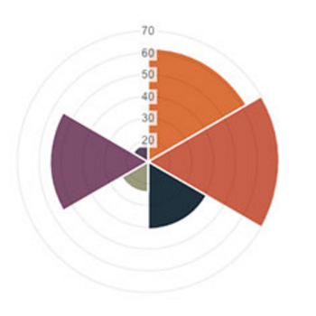
Basically you start with a pie chart representing a fixed amount of
time - say, 128ms. Then for each device transmitting you assign a
slice of the pie for the amount of airtime used. Then, you can show
the amount of data transmitted in that piece of the pie by increasing
the volume plotted for that slice of the pie. And you sweep around
continually (like a radar scanning or a timepiece's pointer) to show
progress over time, and you show multicast and other traffic as eating
the whole pie for however long it lasts.
conceptually it looks a bit like this:
http://blog.cerowrt.org/images/fairness.png (I borrowed this graph
from
http://www.webdesignerdepot.com/2013/11/easily-create-stunning-animated-charts-with-chart-js/
)
Another way to do it would be to have the pie represent all the
stations on the network, and to have the "sweep hand" jump between
them...
does it really matter how much data is passed during the timeslice as
opposed to just how much airtime is used? (and there will be a large chunk
of airtime unused for various reasons, much of which you will not be able
to attribute to any one station, and if you do get full transmit data from
each station, you can end up with >100% airtime use attempted)
I would be looking at a stacked area graph to show changes over time (a
particular source will come and go over time)
I would either do two graphs, one showing data successfully transmitted,
the other showing airtime used (keeping colors/order matching between the
two graphs), or if you have few enough stations, one graph with good lines
between the stations and have the color represent the % of theoretical peak
data transmission to show the relative efficiency of the different
stations.
While the radar sweep updating of a pie graph is a neat graphic, it
doesn't really let you see what's happening over time.
David Lang
_______________________________________________
Bloat mailing list
[email protected]
https://lists.bufferbloat.net/listinfo/bloat
--
David Collier-Brown, | Always do right. This will gratify
System Programmer and Author | some people and astonish the
[email protected] | -- Mark Twain
--
David Collier-Brown, | Always do right. This will gratify
System Programmer and Author | some people and astonish the
[email protected] | -- Mark Twain
_______________________________________________
Bloat mailing list
[email protected]
https://lists.bufferbloat.net/listinfo/bloat
_______________________________________________
Bloat mailing list
[email protected]
https://lists.bufferbloat.net/listinfo/bloat
_______________________________________________
Bloat mailing list
[email protected]
https://lists.bufferbloat.net/listinfo/bloat