On Mon, Apr 18, 2016 at 4:14 PM, David Lang <[email protected]> wrote:
> On Mon, 18 Apr 2016, David Collier-Brown wrote:
>
>> I haven't internalized this yet, but my instantaneous reaction is:
>>
>> *   a radar screen is something people have been educated to
>>   understand, so that's cool, and over time, plotting the time taken
>>   for something against the load in somethings is what capacity
>>   planners expect to see: "_/"
>
>
> I agree, but a radar screen only shows the 'now', and I'm not sure how
> interesting that really is compared to how it looks over time.
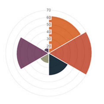
Well summing the "volume" of all the samples over each interval would
be a back-asswards way of getting your bar
graph, but what I wanted to do was be able to get a comparison of the
latency over load simultaneously, also, on stuff like the 4th graph
here: http://blog.cerowrt.org/post/fq_codel_on_ath10k/


> David Lang
>
>
>>
>> --dave
>>
>> On 18/04/16 06:48 PM, David Lang wrote:
>>>
>>> On Mon, 18 Apr 2016, Dave Taht wrote:
>>>
>>>> I have been sitting here looking at wifi air packet captures off and
>>>> on for years now, trying to come up with a representation, over time,
>>>> of what the actual airtime usage (and one day, fairness) would look
>>>> like. Believe me, looking at the captures is no fun, and (for example)
>>>> wireshark tends to misinterpret unreceived retries at different rates
>>>> inside a txop as tcp retries (which, while educational, makes it hard
>>>> to see actual retries)...
>>>>
>>>> Finally today, I found a conceptual model that "fits" - and it's kind
>>>> of my hope that something already out there does this from packet
>>>> captures. (?) Certainly there are lots of great pie chart tools out
>>>> there...
>>>>
>>>> Basically you start with a pie chart representing a fixed amount of
>>>> time - say, 128ms. Then for each device transmitting you assign a
>>>> slice of the pie for the amount of airtime used. Then, you can show
>>>> the amount of data transmitted in that piece of the pie by increasing
>>>> the volume plotted for that slice of the pie. And you sweep around
>>>> continually (like a radar scanning or a timepiece's pointer) to show
>>>> progress over time, and you show multicast and other traffic as eating
>>>> the whole pie for however long it lasts.
>>>>
>>>> conceptually it looks a bit like this:
>>>>
>>>> http://blog.cerowrt.org/images/fairness.png  (I borrowed this graph
>>>> from
>>>> http://www.webdesignerdepot.com/2013/11/easily-create-stunning-animated-charts-with-chart-js/
>>>> )
>>>>
>>>> Another way to do it would be to have the pie represent all the
>>>> stations on the network, and to have the "sweep hand" jump between
>>>> them...
>>>
>>>
>>> does it really matter how much data is passed during the timeslice as
>>> opposed to just how much airtime is used? (and there will be a large chunk
>>> of airtime unused for various reasons, much of which you will not be able to
>>> attribute to any one station, and if you do get full transmit data from each
>>> station, you can end up with >100% airtime use attempted)
>>>
>>> I would be looking at a stacked area graph to show changes over time (a
>>> particular source will come and go over time)
>>>
>>> I would either do two graphs, one showing data successfully transmitted,
>>> the other showing airtime used (keeping colors/order matching between the
>>> two graphs), or if you have few enough stations, one graph with good lines
>>> between the stations and have the color represent the % of theoretical peak
>>> data transmission to show the relative efficiency of the different stations.
>>>
>>>
>>> While the radar sweep updating of a pie graph is a neat graphic, it
>>> doesn't really let you see what's happening over time.
>>>
>>> David Lang
>>>
>>> _______________________________________________
>>> Bloat mailing list
>>> [email protected]
>>> https://lists.bufferbloat.net/listinfo/bloat
>>
>>
>>
>
> _______________________________________________
> Bloat mailing list
> [email protected]
> https://lists.bufferbloat.net/listinfo/bloat
>
> _______________________________________________
> Bloat mailing list
> [email protected]
> https://lists.bufferbloat.net/listinfo/bloat
>


--
Dave Täht
Let's go make home routers and wifi faster! With better software!
http://blog.cerowrt.org
_______________________________________________
Bloat mailing list
[email protected]
https://lists.bufferbloat.net/listinfo/bloat