Hi All,

I'm sorry I surprisingly busy these days with the terrible explosion of
homophobia in France. I don't have time to update what I wanted.
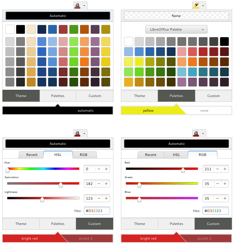
Here are some thought :

- Then, I'm absolutely sure that having Old/New at the bottom in tablet
version is a bad thing. I simulted on My Old Tablet (LDLC Janus), My finger
hide the right item if I try to adapt color in the bottom-left of the
popover. In fact it depend my position (Up, Sit etc) but globally, we
really shouldn't have this at the bottom in tablet version. With the
desktop version obviously it have to be at the bottom
- About having recent colors separated of Theme colors : For me, recent
colors is something you wan't really fast access, as much as Theme colors
(and maybe less than personalized colors, that in document creation,
instead of design, you  choose once and reuse a few times). So for me,
Recents colors must be in the same, first, "window" than theme colors, even
if obviously visually separated
- I think that clicking on the Old color in the "Old/New" preview is sort
of as "close without changing", and very useful : Without that, you can't
exit the popover without changing anything : If you personalize the color,
it's changed, and you only have Ctrl+Z/Cancel option to cancel (one more
action, that not everyone know). So here is an exemple on usage : Click on
the Old color : close without changing anything (keep previous color),
Click on the New color is as clicking somewhere outside the popover : it
"apply" definitively (this is not really useful, but permits a consistent
way with clicking on Old)
- Having New/Old colors in a separate popover : First Time I saw this in
Mirek proposal I absolutely didn't understand what this was (Had to stay on
this 15 minutes to understand). With Mirek Update, it's better but I don't
think it's useful at all but It's not really a big problem any more, except
if we choose to use what I described upthere (click on Old/New), where it
should really stay in the same popover
- About the bottom-right button/Drop-down menu : Okay with the drop
down-menu, but I think it would be better to have a simple button until we
have at least two items : Having a menu with only one item is just
ridiculous.

Just my really fast two cents. If you don't understand what I mean, just
ask I will do my best to answer as fast as possible.

Kévin


2013/4/8 Mirek M. <[email protected]>

> Hi guys,
> I'd really like to get the tentative design finished this week.
> I still think the color preview should be in an area separate from the
> color list -- what do the others think?
> Also, recent colors should be listed on the Recent colors page, not on the
> Theme color page, as, unlike theme colors, recent colors are static. Theme
> colors should not be listed under recent colors, because they're not static.
> I would also like to get rid of the OK button on the Custom color page, as
> it is merely a Close button and pop-overs don't tend to have close buttons.
>
> I updated my proposal a bit so you can see what I mean:
> https://wiki.documentfoundation.org/images/e/ee/Picker-mirek2.png.
>
> It would also be good to have the right alignment, spacing, sizing, etc.,
> so that it's ready for a developer.
>

--
Unsubscribe instructions: E-mail to [email protected]
Problems? http://www.libreoffice.org/get-help/mailing-lists/how-to-unsubscribe/
Posting guidelines + more: http://wiki.documentfoundation.org/Netiquette
List archive: http://listarchives.libreoffice.org/global/design/
All messages sent to this list will be publicly archived and cannot be deleted