We aren't on the same wavelength.  Let me try again.

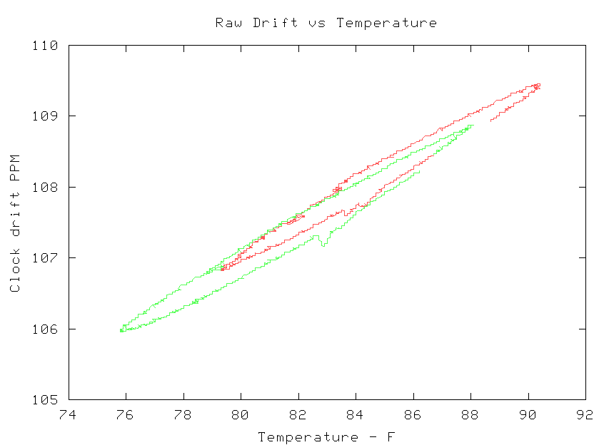
If you can plot temp vs drift, that is temp on the X axis and drift on the Y
axis, then you can see if the relation is linear and/or see the hysteresis.
In this graph, each color is 24 hours.
  http://users.megapathdsl.net/~hmurray/ntp/slope.gif
Mother nature provided the temperature swing.


--
These are my opinions.  I hate spam.


_______________________________________________
devel mailing list
[email protected]
http://lists.ntpsec.org/mailman/listinfo/devel