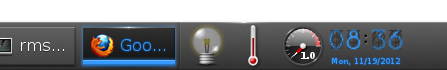
Everyone I show it to agrees with me that there is not enough contrast.

Just look at the text to the left of the clock.
Much more readable even though it's smaller.

Carsten Haitzler <[email protected]> wrote:

>On Mon, 19 Nov 2012 09:55:08 +0000 Rui Seabra <[email protected]> said:
>
>indeed. right. :) seriously - it's zero trouble reading it for me -
>it's not
>even barely an effort.
>
>> Riiight.
>>
>> Carsten Haitzler <[email protected]> wrote:
>>
>> >On Mon, 19 Nov 2012 08:42:32 +0000 Rui Miguel Silva Seabra
>> ><[email protected]> said:
>> >
>> >> You may be very right from an engineering point of view, but from
>an
>> >> usability point of view you're quite wrong as the end result is
>quite
>> >> dark and hard to read:
>> >>
>> >> http://files.1407.org/shot-dark-clock-on-dark-bg.png
>> >
>> >i'm reading it incredibly easily. in fact not even reading - just
>> >glancing at
>> >it and i can read the time just fine.
>> >
>> >> Rui
>> >>
>> >> On Mon, 19 Nov 2012 09:55:29 +0900
>> >> Carsten Haitzler (The Rasterman) <[email protected]> wrote:
>> >>
>> >> > On Sun, 18 Nov 2012 20:40:34 +0000 Rui Miguel Silva Seabra
>> >> > <[email protected]> said:
>> >> >
>> >> > > As of today, some 10 hours ago old tree, the clock is almost
>> >> > > unreadable, being dark blue on dark grey is not good...
>> >> >
>> >> > the day that it dark blue, is the day the sun is deep purple.
>this
>> >> > isn;t a subjective thing - it's provable via rgb values (and
>lets
>> >say
>> >> > you define dark blue as < 0x80 intensity of the maximum
>element).
>> >> >
>> >> > > Rui
>> >> > >
>> >> > >
>> >> > > On Wed, 14 Nov 2012 22:24:19
>> >> > > +0900 Carsten Haitzler (The Rasterman) <[email protected]>
>> >wrote:
>> >> > >
>> >> > > > On Wed, 14 Nov 2012 14:03:52 +0200 "Alex-P. Natsios"
>> >> > > > <[email protected]> said:
>> >> > > >
>> >> > > > massively worse than whats there. in the same way its also
>> >blurry
>> >> > > > and unreadable too (using that term the same way). in
>addition,
>> >a
>> >> > > > serif font where everything else is sans-serif in the theme?
>> >> > > > that's like walking around in a pink suit with green shoes
>and
>> >> > > > expecting to be taken seriously in a business meeting. :)
>> >> > > >
>> >> > > > the clock is mimicing a blue version of a "tube clock":
>> >> > > >
>> >> > > >
>http://assets.ilounge.com/images/uploads/nixie-tube-clock-1.jpg
>> >> > > > http://gadgets.boingboing.net/filesroot/nixie-tube-clock.jpg
>> >> > > >
>>
>>http://i135.photobucket.com/albums/q146/atbglenn/Nixie%20Clock/MyNixieTubeClock.jpg
>> >> > > >
>> >> > > > as such it's a pretty good reproducion of such a thing as it
>> >was
>> >> > > > done by hand, and its perfectly readable. people claiming
>it's
>> >not
>> >> > > > readable are the kind of people who use that word to simply
>say
>> >"i
>> >> > > > dont like it" - it has nothing to do with readability. you
>can
>> >> > > > read is just fine without any problems.
>> >> > > >
>> >> > > > > Greetings,
>> >> > > > >
>> >> > > > > Many people came crying in #e about the new dark digital
>> >clock
>> >> > > > > and those unreasonal scribbles in the numbers back.
>> >> > > > >
>> >> > > > > It looks cool and artistic but it is hard to read :(
>making
>> >it
>> >> > > > > unusable as a module (at least in its digital form).
>> >> > > > >
>> >> > > > > After a brief discussion about it cipher (Haris Antonatos)
>> >> > > > > decided to give it a try and create an alternative set.
>> >> > > > >
>> >> > > > > I think of it as pretty neat and matching with the overall
>> >feel
>> >> > > > > please have a look at it as a possibly viable replacement
>of
>> >the
>> >> > > > > current digital look.
>> >> > > > >
>> >> > > > > http://postimage.org/gallery/f4doc1s/
>> >> > > > >
>> >> > > > > --
>> >> > > > > Best Regards,
>> >> > > > >
>> >> > > > > Alex-P. Natsios
>> >> > > > > (a.k.a Drakevr)
>> >>
>> >
>> >
>> >--
>> >------------- Codito, ergo sum - "I code, therefore I am"
>> >--------------
>> >The Rasterman (Carsten Haitzler)    [email protected]
>>
>> --
>> Sent from my Android phone with K-9 Mail. Please excuse my brevity.
>>
>------------------------------------------------------------------------------
>> Monitor your physical, virtual and cloud infrastructure from a single
>> web console. Get in-depth insight into apps, servers, databases,
>vmware,
>> SAP, cloud infrastructure, etc. Download 30-day Free Trial.
>> Pricing starts from $795 for 25 servers or applications!
>> http://p.sf.net/sfu/zoho_dev2dev_nov
>> _______________________________________________
>> enlightenment-devel mailing list
>> [email protected]
>> https://lists.sourceforge.net/lists/listinfo/enlightenment-devel
>>
>
>
>--
>------------- Codito, ergo sum - "I code, therefore I am"
>--------------
>The Rasterman (Carsten Haitzler)    [email protected]

--
Sent from my Android phone with K-9 Mail. Please excuse my brevity.
------------------------------------------------------------------------------
Monitor your physical, virtual and cloud infrastructure from a single
web console. Get in-depth insight into apps, servers, databases, vmware,
SAP, cloud infrastructure, etc. Download 30-day Free Trial.
Pricing starts from $795 for 25 servers or applications!
http://p.sf.net/sfu/zoho_dev2dev_nov
_______________________________________________
enlightenment-devel mailing list
[email protected]
https://lists.sourceforge.net/lists/listinfo/enlightenment-devel