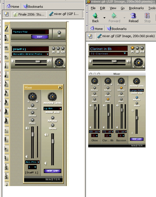
On 27 Jul 2005 at 22:43, Aaron Sherber wrote:

> At 10:30 PM 07/27/2005, David W. Fenton wrote:
>  >Not on my PC:
>  >
>  >http://dfenton.com/Mixer.gif
>
> Okay, well now we're just splitting hairs. I'll grant you that the
> characters in my screenshot have sharper outlines, but the characters
> are all chunky, like an old-fashioned bitmap font. The characters in
> the Finale screenshot are more recognizable as characters, even though
> they're fuzzy.
So, you've just discovered that Mac anti-aliasing is better than
Windows?

> And the fuzziness is largely due to the fact that the Finale
> screenshots are probably slightly reduced. In the Fin2006 Quick Start
> Guide, there's a pasted screenshot -- also from the Mac version -- in
> which the font is quite clear.
>
> And Winsupport has already admitted that the font reads much less well
> in Windows than it does on Mac. They said, "I think it has to do with
> the new display controls in the Mac OS," which sounds like a rather
> lame excuse.

Doesn't sound lame to me. Mac has significant differences in its font
rendering technologies, and always has, and that's one of the reasons
graphics people prefer the Mac.

--
David W. Fenton                        http://www.bway.net/~dfenton
David Fenton Associates                http://www.bway.net/~dfassoc

_______________________________________________
Finale mailing list
[email protected]
http://lists.shsu.edu/mailman/listinfo/finale