Hi.
First congratulations for the new User-Installation Dialogs.
But I cannot resist to comment on it :-)
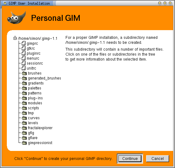
* There seems to be a problem with the big titles. As you can see
at http://www.home.unix-ag.org/simon/gimp/GimpUserInstallation.png
the title of an page gets cut off (Gimp CVS from
Sat Mar 25 02:01:18 CET 2000 ).
* The dialog is quite huge, it does not fit on a 640x480 screen
completely. Do we need to fix this?
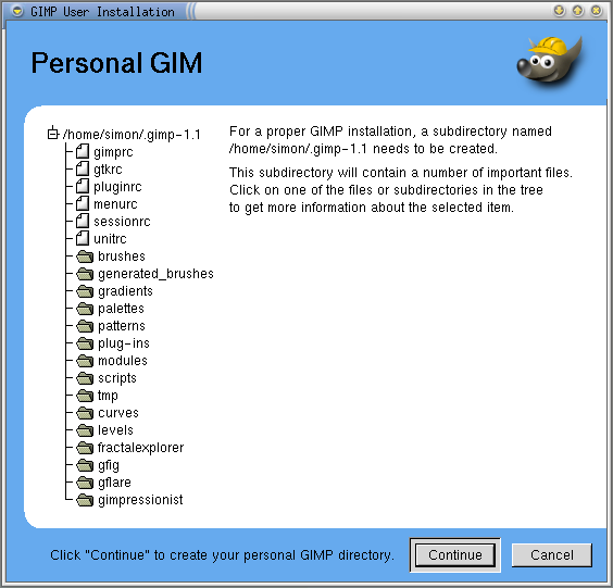
* Personally I dont like the orange color. I prefer blue, but this is
personal preference. I tried an alternative layout (with Gimp - not C :-)
(moving Wilber to the right, blue color) and created another
Wilber-Icon with a helmet on to indicate that there is real Work
going on :-)
You can see a pseudo-screenshot at
http://www.home.unix-ag.org/simon/gimp/GimpUserInstallation2.png
The XCF of the new Wilber is available at
http://www.home.unix-ag.org/simon/gimp/wilber_work2.xcf.gz
What do you think?
The defaults from gimprc are questionable IMHO. The default imagesize
is not specified and defaults to something around 950x760, which is
pretty close to my screen resolution. Maybe we should default to
something like 300x300 ?
Is there a reason, why (install-colormap) is not enabled by default?
Gimp needs pretty much colors and probably wont start on most
systems with 8bit color. Enabling this has no negative impact on
Truecolor users. So if somebody really uses gimp as the only application
on an 8bit screen he can switch this Option off manually to avoid
flashing.
The default toolbox-layout is IMHO ugly. Should we default to the
layout with three columns? This has the positive effect that people
updating from Gimp 1.0 will not be confused unnecessary.
Opinions?
Bye,
Simon
--
[EMAIL PROTECTED] http://www.home.unix-ag.org/simon/