Just rebooted the machine in case.  Still happening and here is the source
code:
<script type="text/javascript"> google.load("visualization", "1",
{packages:["corechart"]}); google.setOnLoadCallback(drawChart); function
drawChart() { var data = google.visualization.arrayToDataTable([ ['Date',
'http://www.vi.net/dedicated-servers/','http://www.vi.net/dedicated-servers/','http://www.vi.net/dedicated-servers/'],
['2012-11-22', 68, 68, 68, ],['2012-11-23', 70, 70, 70, ],['2012-11-24',
67, 67, 67, ],['2012-11-25', 65, 65, 65, ],['2012-11-26', 65, 65, 65,
],['2012-11-27', 65, 65, 65, ], ]); var options = { title: 'Keyword
Ranking Data', backgroundColor: {strokeWidth:2,stroke:'#DDD'}, chartArea:
{top:60,padding:100,width:'80%', height:'50%'}, pointSize: 5, hAxis:
{baseline:1,showTextEvery:1,direction:1,slantedText:true}, vAxis:
{gridlines: {count:10},
format:'#',direction:-1,minValue:1,maxValue:100,viewWindowMode:'pretty',textPosition:'out'},
legend: {position:'bottom'}, curveType: 'function' }; var chart = new
google.visualization.LineChart(document.getElementById('chart_div'));
chart.draw(data,
options); } </script>
On Tuesday, 27 November 2012 17:05:07 UTC, Patrick McCarthy wrote:
>
> It happens in all my browsers. Chrome, IE and Firefox...
>
> On Tuesday, 27 November 2012 16:58:18 UTC, asgallant wrote:
>>
>> What browser are you seeing this in? I can't replicate it with any of my
>> charts.
>>
>> On Tuesday, November 27, 2012 8:33:00 AM UTC-5, Patrick McCarthy wrote:
>>>
>>>
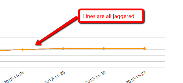
>>> <https://lh3.googleusercontent.com/-1ra82_k7f3o/ULTBARhhLyI/AAAAAAAAAF4/oErb2LyJmd8/s1600/Untitled-2.jpg>
>>> The line on my charts have suddenly gone all jaggered. Any ideas?
>>>
>>> On Wednesday, 4 February 2009 00:38:57 UTC, RodgerWilko! wrote:
>>>>
>>>> Hi,
>>>>
>>>> Is it possible to draw a Smooth Line Chart.
>>>>
>>>> To give an example, the following chart
>>>> http://code.google.com/apis/ajax/playground/#line_chart
>>>> is very rigid around the points.
>>>>
>>>> As apposed to something like this
>>>>
>>>> http://www.domain.com.au/public/ChartHousePrice.aspx?Type=House&Suburb=Sydney&PostCode=2000
>>>>
>>>>
>>>> I realise we could add lots of points around the main point to try and
>>>> make it not soo 'sharp' but I think it would be better to have the
>>>> functionality in the charts.
>>>>
>>>> If it's not available, is there a place to request functionality like
>>>> this?
>>>>
>>>> Thanks,
>>>>
>>>> RodgerWilko!
>>>
>>>
--
You received this message because you are subscribed to the Google Groups
"Google Visualization API" group.
To view this discussion on the web visit
https://groups.google.com/d/msg/google-visualization-api/-/XDfpUzf1yikJ.
To post to this group, send email to [email protected].
To unsubscribe from this group, send email to
[email protected].
For more options, visit this group at
http://groups.google.com/group/google-visualization-api?hl=en.