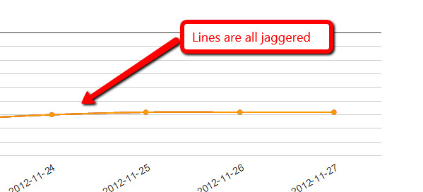
Ok, I put it up in a jsfiddle and played around a bit.  It looks like this
is an artifact of less than perfect anti-aliasing in the browser,
exacerbated by the fact that your 3 lines all exactly overlay one another.
 If you separate out the lines, you can still see the effect if you look
for it, but it's nowhere near as pronounced.  See here:
http://jsfiddle.net/asgallant/rDWu5/
Also, you have an errant comma problem in your code that will cause IE to
bomb if you try to run that (notes in the fiddle).

On Tuesday, November 27, 2012 12:12:35 PM UTC-5, Patrick McCarthy wrote:
>
> Just rebooted the machine in case.  Still happening and here is the source
> code:
>
> <script type="text/javascript"> google.load("visualization", "1",
> {packages:["corechart"]}); google.setOnLoadCallback(drawChart); function
> drawChart() { var data = google.visualization.arrayToDataTable([ ['Date',
> 'http://www.vi.net/dedicated-servers/','
> http://www.vi.net/dedicated-servers/','
> http://www.vi.net/dedicated-servers/'], ['2012-11-22', 68, 68, 68,
> ],['2012-11-23', 70, 70, 70, ],['2012-11-24', 67, 67, 67, ],['2012-11-25',
> 65, 65, 65, ],['2012-11-26', 65, 65, 65, ],['2012-11-27', 65, 65, 65, ],
> ]);  var options = { title: 'Keyword Ranking Data', backgroundColor:
> {strokeWidth:2,stroke:'#DDD'}, chartArea:
> {top:60,padding:100,width:'80%', height:'50%'}, pointSize: 5, hAxis:
> {baseline:1,showTextEvery:1,direction:1,slantedText:true}, vAxis:
> {gridlines: {count:10},
> format:'#',direction:-1,minValue:1,maxValue:100,viewWindowMode:'pretty',textPosition:'out'},
>
> legend: {position:'bottom'}, curveType: 'function' };  var chart = new
> google.visualization.LineChart(document.getElementById('chart_div'));
> chart.draw(data,
> options); } </script>
> On Tuesday, 27 November 2012 17:05:07 UTC, Patrick McCarthy wrote:
>>
>> It happens in all my browsers.  Chrome, IE and Firefox...
>>
>> On Tuesday, 27 November 2012 16:58:18 UTC, asgallant wrote:
>>>
>>> What browser are you seeing this in?  I can't replicate it with any of
>>> my charts.
>>>
>>> On Tuesday, November 27, 2012 8:33:00 AM UTC-5, Patrick McCarthy wrote:
>>>>
>>>>
>>>> <https://lh3.googleusercontent.com/-1ra82_k7f3o/ULTBARhhLyI/AAAAAAAAAF4/oErb2LyJmd8/s1600/Untitled-2.jpg>
>>>> The line on my charts have suddenly gone all jaggered.  Any ideas?
>>>>
>>>> On Wednesday, 4 February 2009 00:38:57 UTC, RodgerWilko! wrote:
>>>>>
>>>>> Hi,
>>>>>
>>>>> Is it possible to draw a Smooth Line Chart.
>>>>>
>>>>> To give an example, the following chart
>>>>> http://code.google.com/apis/ajax/playground/#line_chart
>>>>> is very rigid around the points.
>>>>>
>>>>> As apposed to something like this
>>>>>
>>>>> http://www.domain.com.au/public/ChartHousePrice.aspx?Type=House&Suburb=Sydney&PostCode=2000
>>>>>
>>>>>
>>>>> I realise we could add lots of points around the main point to try and
>>>>> make it not soo 'sharp' but I think it would be better to have the
>>>>> functionality in the charts.
>>>>>
>>>>> If it's not available, is there a place to request functionality like
>>>>> this?
>>>>>
>>>>> Thanks,
>>>>>
>>>>> RodgerWilko!
>>>>
>>>>

--
You received this message because you are subscribed to the Google Groups
"Google Visualization API" group.
To view this discussion on the web visit
https://groups.google.com/d/msg/google-visualization-api/-/L6iXGT9QTO0J.
To post to this group, send email to [email protected].
To unsubscribe from this group, send email to
[email protected].
For more options, visit this group at
http://groups.google.com/group/google-visualization-api?hl=en.