https://bugs.freedesktop.org/show_bug.cgi?id=85693
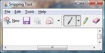
--- Comment #16 from Mirek2 <[email protected]> ---
(In reply to Jay Philips from comment #15)
> (In reply to Mirek2 from comment #14)
> > > Please enlighten me, as i dont see Gnome icons used on Windows, OSX or
> > > Ubuntu. :D
> > >
> >
> > Well, Ubuntu's icon theme is based on elementary, and neither has the same
> > amount of icons as Gnome and both seem to use Gnome as a "fallback", so some
> > Gnome icons seep through. For example:
> > http://blogs.gnome.org/jnelson/files/2012/05/geary-screenshot-2.png (the
> > font and paragraph icons are Gnome's).
>
> Yes i'm aware that Ubuntu's human icon theme is based on tango/gnome icons,
> so i guess some of gnomes those icons would appear to ubuntu users.
>
> > And there are various pieces of software that use Gnome's icons on other
> > platforms -- https://documenteditor.codeplex.com/ , for example.
>
> Well gnome icons appearing in software will always happen, as the icons are
> open source. Document editor seems interesting with their 40x40 icons as
> well as modifying a number of the default gnome icons like numbering list.

The large icons are there because of the nature of the ribbon -- not really
applicable in our case.

Gnome doesn't have its own ordered list icon -- the LibreOffice one was
designed by me.

BTW, it'd be great to share our icons with projects like these. I'll ask
someone from the Gnome team if they'd link to icon sets that extend theirs from
their git repository.

> > > Yes it would be more practical to use all unique icons, but see the
> > > likelihood of the floppy icon appearing on a user's OS and LO's toolbar
> > > being very slim, that wouldnt warrant us having to change the icon. I see
> > > that as long as LO doesnt use the same icon twice to mean two different
> > > things, we use the icon to represent what we want in the app.
> >
> > No -- it's a slippery slope, really, I don't ever want to use the same icon
> > to mean two completely different things.
>
> Well lets see what Alex can come up with then.

Sounds good. :)

> > > Yes i can see how the unique purple color could be associated exclusively
> > > with saving, but as no purple floppy disks were created, having an object
> > > in
> > > a color it is never know to be colored in doesnt work that well.
> >
> > Why? To me, it works well precisely because of that -- since there is no
> > physical object of that color, a floppy disk of this color always means
> > saving and never means the device. The save icon is recognized by shape, not
> > by color.
>
> Seems i was mistaken about there never being purple floppies, as my friend
> said he had some growing up (
> http://us.123rf.com/400wm/400/400/fberti/fberti1104/fberti110400153/9320845-
> two-floppy-disk-3d-illustration.jpg ) and see through ones (
> http://science.opposingviews.com/DM-Resize/photos.demandstudios.com/getty/
> article/176/133/AA039252.jpg?w=600&h=600&keep_ratio=1 ). Yes the save icon
> as a floppy is primarily known by the shape.

OK, cool. :)

> > Incidentally, Word 2007 and 2010 have purple save icons:
> > http://i.stack.imgur.com/tPbpM.jpg . (This may have subconsciously inspired
> > me, as I have used Office 2007.)
>
> Though i have Word 2007, i add the save icon to the top bar, i never click
> on the office icon to have seen the purple there, but do use the MS snipping
> tool and see they are using the purple floppy icon there (
> http://www.computerperformance.co.uk/images/Vista/snipping_tool.jpg ).

OK.
Would you be okay with purple, then? Its wide use could help with recognition.

> > > They had designed these icons at 5 different icon sizes knowing that users
> > > would be having various screen resolutions that these icons can be shown.
> > > But as LO only has 16x16 and 24x24, these icons do look small and
> > > sometimes
> > > unclear on most screen available these days. I personally love the gnome
> > > tango icons at 32x32 or 48x48 at my screen resolution (1440x900), but the
> > > 24x24 icons look blurry due to the gradients on the stroke and glossy
> > > effect
> > > found on the character based icons.
> >
> > These icons were designed specifically for 16x16 and 22x22 (we add a 1px
> > margin), and all versions were designed for the same screen resolution. The
> > other sizes are there for applications that use extra large icons in their
> > toolbars or for use outside toolbars (dialogs, for example).
>
> Though designed at the same screen resolution, users see the icons at
> different screen resolutions. So when a user sees the 24x24 icons at
> 800x900, it is quite different from a user seeing the same icons at
> 1920x1080.
>
> Well i think if we want to stick with the purple, we try to make it clearer,
> similar to ( http://www.jeffs-icons.com/System_Icons.html ) and the ones in
> ms office or ms snipping tool. Alternatively we could possibly go the save
> arrow on a folder approach like (
> http://www.ulpanor.com/eton/include/images/download_icon.png ) and (
> http://edwardevers.com/javascript/html5/common/images/save_icon.png ).

OK, clearer sounds good, though I don't like the first example you pointed to.
Microsoft's icons are great, though. :)

The actual Gnome save icon uses a green arrow symbol over a file cabinet, but
it was rejected by the team after Bjorn Balazs's research showed it wasn't
easily recognizable.

--
You are receiving this mail because:
You are the assignee for the bug.
_______________________________________________
Libreoffice-bugs mailing list
[email protected]
http://lists.freedesktop.org/mailman/listinfo/libreoffice-bugs