https://bugs.freedesktop.org/show_bug.cgi?id=85693
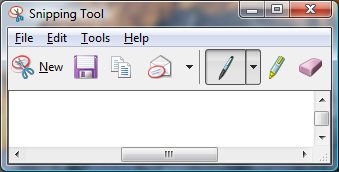
--- Comment #17 from Jay Philips <[email protected]> ---
(In reply to Mirek2 from comment #16)
> > Well gnome icons appearing in software will always happen, as the icons are
> > open source. Document editor seems interesting with their 40x40 icons as
> > well as modifying a number of the default gnome icons like numbering list.
>
> The large icons are there because of the nature of the ribbon -- not really
> applicable in our case.

Well i believe the ribbon could have been created with smaller icons, but
microsoft chose to use 32x32 icons and above for icons which need more
emphasis.

> Gnome doesn't have its own ordered list icon -- the LibreOffice one was
> designed by me.

Thanks for designing them. I'm currently modifying them and will have Alex
create the svgs.

> BTW, it'd be great to share our icons with projects like these. I'll ask
> someone from the Gnome team if they'd link to icon sets that extend theirs
> from their git repository.

Yes it would be great to contribute something back to them in they are
interested in having it, though i think they would also want larger sizes as
well. :D

> > Though i have Word 2007, i add the save icon to the top bar, i never click
> > on the office icon to have seen the purple there, but do use the MS snipping
> > tool and see they are using the purple floppy icon there (
> > http://www.computerperformance.co.uk/images/Vista/snipping_tool.jpg ).
>
> OK.
> Would you be okay with purple, then? Its wide use could help with
> recognition.

I'm fine with the purple as long as it clear. The funny thing is that microsoft
used a black floppy in MS Office for Mac. :D

> > Well i think if we want to stick with the purple, we try to make it clearer,
> > similar to ( http://www.jeffs-icons.com/System_Icons.html ) and the ones in
> > ms office or ms snipping tool. Alternatively we could possibly go the save
> > arrow on a folder approach like (
> > http://www.ulpanor.com/eton/include/images/download_icon.png ) and (
> > http://edwardevers.com/javascript/html5/common/images/save_icon.png ).
>
> OK, clearer sounds good, though I don't like the first example you pointed
> to. Microsoft's icons are great, though. :)

I liked the solid gray metal part as it stands out well against the purple. :D

> The actual Gnome save icon uses a green arrow symbol over a file cabinet,
> but it was rejected by the team after Bjorn Balazs's research showed it
> wasn't easily recognizable.

Yes i've seen the gnome save icons of the arrow in the cabinet and didnt think
it was very understandable. Atleast original tango was using a hard disk. :D

Well about the save as icon, i think we should stick with the pencil, as that
is what is used pretty much everywhere and we can pull the pencil from the find
& replace icon and add it to the purple floppy.

--
You are receiving this mail because:
You are the assignee for the bug.
_______________________________________________
Libreoffice-bugs mailing list
[email protected]
http://lists.freedesktop.org/mailman/listinfo/libreoffice-bugs