As a result of a conversation in another thread about helping jumpstart the
MooTools community and development, I thought I would try my hand at
refreshing the look of the website. A couple things before I share the
links to the mockups, though.
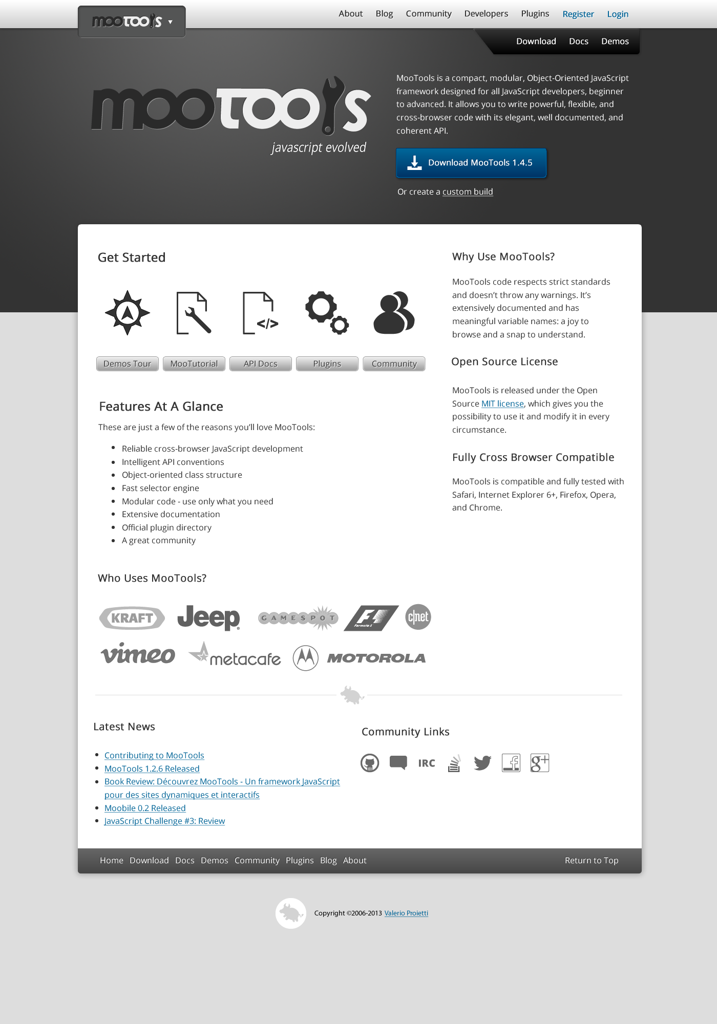
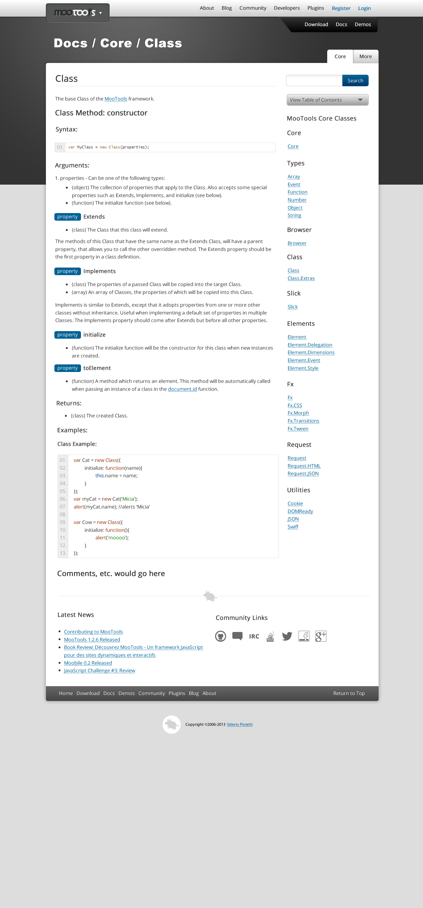
   1. The look of the current website isn't bad. I've done my best to try
   to capture the spirit of it in the mockups while still making it new.
   2. This would be more of a facelift than a complete overhaul. I'm not
   completely sure how everything is pulled into the site from GitHub, but I
   don't think there would have to be any major content rewrites.
   3. The purpose for the redesign is to show the community that MooTools
   is still alive and active, while making some slight improvements.

The primary goals are:

   1. Make it easier for new users to figure out what to do and get started.
   2. Maintain the same general structure for existing MooTools users in
   order to minimize friction because of the transition.
   3. Place a bigger emphasis on community.
   4. Make the site responsive and accessible for mobile devices. For this,
   I would use my new UI
framework<https://github.com/VirtuosiMedia/VM-UI-Framework>,
   based on MooTools.

I've only created two image mockups at this point to get feedback before
going any further. I've put them up on
GitHub<https://github.com/VirtuosiMedia/MooTools-Website-Mockups>.
Here are the mockups for a new front
page<https://raw.github.com/VirtuosiMedia/MooTools-Website-Mockups/master/pages/front.png>and
 a documentation
page<https://raw.github.com/VirtuosiMedia/MooTools-Website-Mockups/master/pages/docs.png>(you'll
 probably have to enlarge them in your browser).

For the front page, I wanted to make it clearer what to do when you get
there. The current page has a lot of text, which I wanted to reduce and
streamline. I also felt that visually showing the logos of sites using
MooTools is much more impactful than just using links. The footer, which
would appear on every page of the site, would have dynamic links to the
blog, as well as links to various social media accounts or communities
which already exist. This will make blog updates more apparent, grow the
community in more channels, and have the added benefit of more SEO power to
the link targets.

The docs page is largely unchanged from its current form. I did remove the
left column in favor of a two column layout to make more room for the
actual content. The Core classes navigation would all be viewable by
clicking on the gray "View All Core Classes" button, which would slide them
into view. The large title across the top would also function as a
breadcrumb.

So, all that said, I'd love to get your feedback. Do you love it? Hate it?
Have suggestions for improvements? This is just a first iteration and the
margins and alignment aren't all perfect yet, I just wanted to get
something out there. The next steps would be to iterate based on feedback,
produce more mockups for different pages on the site, and then to do a live
prototype. It would also be helpful if someone could explain how the
website is currently compiled, as that might have some impact on the design
and implementation. Can't wait to hear what you think.

--

---
You received this message because you are subscribed to the Google Groups
"MooTools Users" group.
To unsubscribe from this group and stop receiving emails from it, send an email
to mootools-users+unsubscr...@googlegroups.com.
For more options, visit https://groups.google.com/groups/opt_out.