pippin;583858 Wrote:
> 1. Umm, no. Could you file a ticket, please?
>
> 2. Like what? I mean, right now it should be pretty aggressive already,
> when it was on the iPhone it looked quite different. What would help
> here?
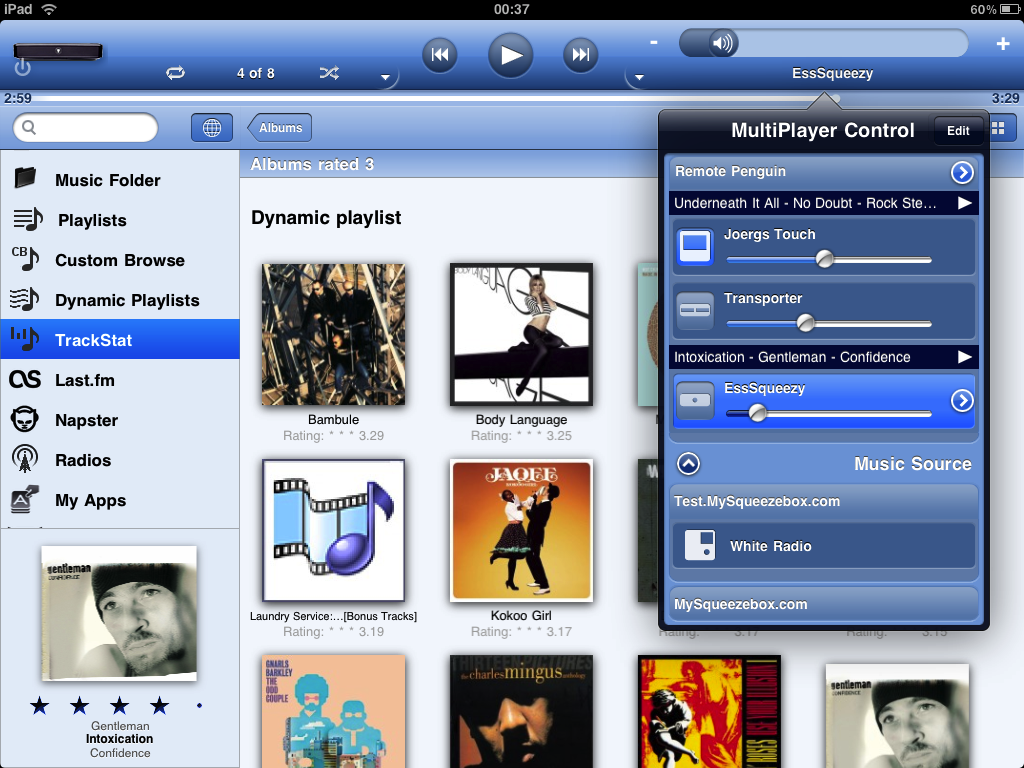
1. Ticket filed.

2. Using
http://penguinlovesmusic.de/wp-content/gallery/ipeng4ipad/img_0113.png
as reference.

Joergs Touch = The player is On, the player is not selected.
Transporter = The player is Off, the player is not selected.
EssSqueezy = The player is Off, the player is selected.

I tried an identical setup and let my friends use the application.
Almost all of them thought that EssSqueezy was On and selected. They
did not spot that Joergs Touch was actually On.
Two of my friends did not spot that EssSqueezy was selected, only that
Joergs Touch was set to On.

Personally I would change two things.
1. Make the entire player bar background, when it's selected, a bit
brighter in color and add a thin white border.
2. Make the player icon background, when used as On, in a brighter
color as well as adding a thin white border.

I know it's hard to make this look smooth and not cluttered but I do
believe it can be done a little bit more obvious without irritating
your eyes.


Would love hearing input from other iPeng for iPad users as well.


--
kott
------------------------------------------------------------------------
kott's Profile: http://forums.slimdevices.com/member.php?userid=25879
View this thread: http://forums.slimdevices.com/showthread.php?t=51929

_______________________________________________
plugins mailing list
[email protected]
http://lists.slimdevices.com/mailman/listinfo/plugins